Click "Run Processing" to generate the image
Magellan Radar Demo - ML-Powered Surface Analysis | by Henrik Hargitai & Viktor Somogyi for HUN-REN / ESA
Processing...
Click: local patch analysis | Enlarge: use magnifier button
Click "Run Processing" to generate the image
Drag to move the ROI box. Drag corners to resize.
Position: X: 0, Y: 0
Size: 512 x 450 px
Size: 128-512 pixels (min-max)
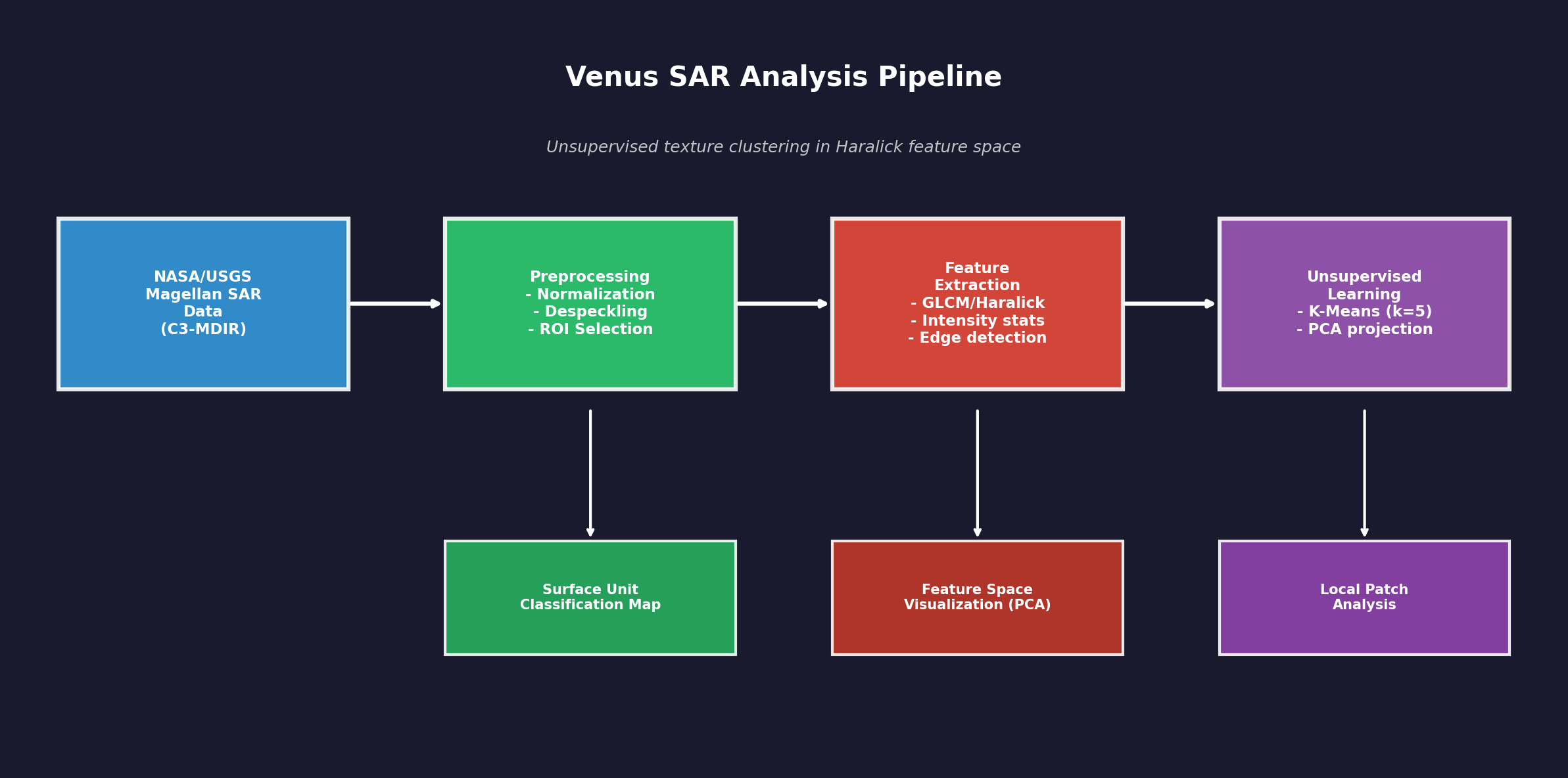
Data flow: SAR data from NASA/USGS Magellan mission is preprocessed (normalization, despeckling), then texture features are extracted using GLCM/Haralick methods. K-Means clustering groups similar texture patches into surface units. PCA projects the feature space to 2D for visualization.
This is unsupervised exploration - no geological labels are assigned. The tool proposes preliminary surface units based on texture similarity.
Loading 3D model...
Interactive 3D model of Venus surface. Use mouse to rotate, scroll to zoom.
This presentation was given at the Linux Foundation Amsterdam conference in the OpenSource AI/ML_DEV section. Viktor Somogyi presents the Venus SAR Exploratory Lab project.
The current web-based application of the Venus SAR Exploratory Lab is a lightweight, easily shareable, interactive demonstration and exploratory interface for NASA Magellan Synthetic Aperture Radar (SAR) data of Venus.
The long-term objective, however, is significantly more ambitious: the development of a supervised machine-learning model trained on annotated data, capable of more reliable and scientifically rigorous identification and analysis of planetary geological features.
At present, this complete system cannot be presented on the web in the same way, as the actual development environment involves orders of magnitude larger datasets (hundreds of gigabytes) and substantially higher computational requirements. The goal, nevertheless, is to make the results of the future, validated supervised pipeline presentable in a similarly transparent and interactive form.
Viktor Somogyi is the ML/AI engineer and lead developer of the project, while Henrik Hargitai, Ph.D. is a planetary geographer and geologist, contributing to the geological interpretation framework and scientific context.
The Venus SAR Exploratory Lab is a web-based interactive application designed to support exploratory analysis of Synthetic Aperture Radar (SAR) imagery acquired by the NASA Magellan spacecraft between 1990 and 1994.
Its purpose is to examine surface patterns on Venus using image processing and machine learning tools, in a way that is transparent, explainable, and suitable for educational use.
This application is not a geological classification system.
Its outputs are exploratory and hypothesis-generating, and all results require expert interpretation. The application does not assign geological labels (e.g., "this is definitely a lava flow") to detected patterns.
The application uses a widely adopted global Magellan mosaic published by the NASA Planetary Data System (PDS) and USGS Astrogeology:
The web application downloads the mosaic on first use and caches it locally.
SAR backscatter intensity is not an optical photograph. Pixel values represent radar signal backscatter, which may be influenced by surface roughness, slope, and viewing geometry (incidence angle). A general interpretation framework is:
SAR is not a camera: Unlike a photograph, this image wasn't made with light. SAR (Synthetic Aperture Radar) works by sending radio waves to the surface and measuring what bounces back. It's more like echolocation (how bats "see") than photography.
Why does this matter? In photos, we see color and shadows based on sunlight. In radar images, we see how much radio energy bounced back. This depends on three main things:
Geography application: Once you understand this, you can start "reading" the landscape. A bright ring might be a crater rim (rough, angled surface). A dark patch might be a smooth lava plain. Scientists use these patterns to understand Venus's geology without ever landing there.
The Venus SAR Exploratory Lab provides several processing modes. All modes operate on the same Region of Interest (ROI), allowing the user to view the same surface area through different analytical perspectives.
The normalized backscatter intensity image of the selected ROI, scaled to the 0-1 range. This serves as the reference for all other processing modes.
What you're seeing: This is a "photograph" of Venus taken not with light, but with radio waves. The Magellan spacecraft orbited Venus and sent radar signals down to the surface. When those signals bounced back, the spacecraft recorded them - that's what creates this image.
Why radar? Venus is covered by thick clouds that block visible light completely. Radar waves can pass through clouds, so this is the only way we can "see" the surface without landing on it.
How to read it: Bright areas = rough surfaces or slopes facing the spacecraft. Dark areas = smooth surfaces or areas in "radar shadow." Think of it like shining a flashlight on a textured wall - bumpy parts reflect more light back to you.
The computer science: The raw data is just numbers (pixel values). We normalize them to a 0-1 range so that 0 = darkest and 1 = brightest, making it easier for both humans and algorithms to work with the data consistently.
SAR imagery inherently contains speckle noise resulting from coherent interference. The system applies median filtering to reduce speckle, which can improve the stability of subsequent texture- and edge-based analyses, while potentially smoothing out some fine details.
The problem: Radar images have a grainy, "salt and pepper" look called speckle. This isn't real surface detail - it's noise created by the way radar waves interfere with each other. Imagine trying to hear someone talk in a room with echo - the echo isn't part of their voice, it's just interference.
The solution: We use a "median filter" - the computer looks at each pixel and its neighbors, sorts their values, and picks the middle one. This removes extreme bright or dark spots (the noise) while keeping real features.
Geography connection: Smoother images help us see actual landforms better - like distinguishing between a real volcanic feature and random radar noise. However, very small details might get smoothed away too, so there's always a trade-off.
Real-world analogy: It's like using noise-canceling headphones - they remove the unwanted background noise so you can hear the music (the real signal) more clearly.
The system computes Haralick texture metrics based on Gray-Level Co-occurrence Matrices (GLCM), using block-based analysis (e.g., 16x16 px). Extracted metrics (contrast, homogeneity, energy, correlation) are texture descriptors and do not identify geological units by themselves; however, they are useful for comparing surface patterns and supporting further exploratory analysis.
What is texture? Texture describes how "busy" or "smooth" an area looks. A field of grass has a different texture than a parking lot, even if they're the same color. On Venus, different geological regions have different textures.
How does the computer measure texture? The GLCM method asks: "If I'm looking at a pixel, what values do its neighbors usually have?" If neighbors are very different (high contrast), the area is rough/varied. If neighbors are similar (high homogeneity), the area is smooth/uniform.
The four measurements:
Geography connection: Different geological surfaces (lava flows, fractured terrain, plains) have characteristic textures. By measuring texture mathematically, we can start to distinguish between different types of terrain - though this alone can't tell us exactly what geological feature we're looking at.
Sobel and Canny operators highlight locations of strong local intensity change. This can be useful for visualizing structural transitions, but an important limitation is that not every detected edge represents a geological boundary; noise, shadowing, or processing artifacts may also produce edges.
What are edges? An edge is where brightness changes suddenly - like the border between a white wall and a dark door. In planetary images, edges might indicate cliffs, crater rims, lava flow boundaries, or fault lines.
How does edge detection work? The Sobel operator calculates how quickly brightness changes horizontally and vertically. Big changes = edges. The Canny detector refines this further, finding thin, connected edge lines.
Why two directions? Sobel X finds vertical edges (things that change left-to-right), Sobel Y finds horizontal edges (things that change top-to-bottom). Together they catch edges at any angle.
Geography connection: Linear features on Venus (fractures, ridges, flow boundaries) often appear as edges. However, radar shadows and noise can also create false edges, so scientists must interpret results carefully.
Computer science insight: Edge detection is fundamental to computer vision - it's used everywhere from self-driving cars (detecting road lanes) to medical imaging (finding tumor boundaries).
In this mode, the system samples patches (e.g., 32x32 px) from the ROI and computes feature vectors for each patch (mean, standard deviation, plus Haralick metrics), followed by K-Means clustering. The output represents unsupervised grouping of areas with similar texture, not geological unit identification. A PCA scatter plot is provided to visualize the structure of the feature space.
The big idea: Instead of a human looking at the image and saying "this area looks different from that one," we let the computer find groups automatically. This is called "unsupervised learning" - the computer learns patterns without being told what to look for.
How K-Means works: Imagine you have a pile of mixed candies and want to sort them into 5 groups by color. You'd put similar colors together. K-Means does the same thing, but instead of color, it groups image patches by their texture properties (the 6 numbers we measure for each patch).
What is PCA? Each patch has 6 measurements, which is hard to visualize (we can't draw in 6 dimensions!). PCA compresses these 6 numbers into 2 numbers while keeping the most important differences. This lets us plot the patches on a 2D scatter chart to see how they cluster.
Geography connection: Different terrain types (smooth plains, rough highlands, fractured zones) should have different textures and therefore fall into different clusters. However, one cluster doesn't mean "this is definitely lava" - it just means "these areas have similar texture properties."
Why 5 clusters? We chose 5 as a reasonable starting point. The real Venus surface might have more or fewer distinct terrain types in any given region. This is exploratory analysis, not definitive classification.
This mode does not perform classification. Instead, it highlights where texture properties change strongly over short spatial distances. After sliding-window feature extraction, a continuous 0-1 boundary likelihood map is generated based on feature-space distances between neighboring windows. High values indicate texture discontinuities, which may correspond to surface unit boundaries, but the output remains exploratory and interpretation-dependent.
The question we're asking: Where does the surface character change? If you're walking across a beach and suddenly the sand becomes rocky, that's a boundary. We're looking for similar transitions on Venus.
How it works: The computer slides a small window across the image. For each position, it measures the texture. Then it asks: "Is this window's texture very different from its neighbors?" If yes, we're probably at a boundary.
The heat map: The result is a probability map from 0 to 1. Bright/warm colors (close to 1) mean "texture changes a lot here" - likely a boundary. Dark/cool colors (close to 0) mean "texture is consistent" - probably the middle of a uniform region.
Geography connection: Geological unit boundaries (where lava flow meets older terrain, or where one rock type transitions to another) often show up as texture discontinuities. This can help scientists identify areas worth studying in more detail.
Important limitation: Not every texture change is a real geological boundary - some might be artifacts or gradual transitions. This tool highlights candidates for human expert review, not definitive boundaries.
Using a structure tensor approach, the system computes a local orientation field and an associated coherence/anisotropy metric (0 = isotropic, 1 = strongly directional). Visualization is performed using an HSV color scheme (hue: orientation, brightness: coherence), with an optional rose diagram. This mode is not a geological classification, but a visualization of directional fabric and confidence in the orientation estimate.
What are we looking for? Many geological features have a preferred direction - fault lines run parallel to each other, lava channels flow in one direction, ridges align along tectonic trends. This mode finds and visualizes those directions.
How it works: The "structure tensor" is a mathematical tool that looks at how brightness changes in all directions around each pixel. If changes are much stronger in one direction than others, that pixel has a clear orientation.
The color map explained:
The rose diagram: A circular histogram showing which directions are most common across the whole image. Peaks in the diagram indicate dominant structural orientations.
Geography connection: Tectonic forces create aligned features - parallel fractures, linear ridges, elongated volcanic structures. Seeing a consistent orientation across a region might indicate underlying geological processes that created aligned structures.
The "180° ambiguity": A line pointing northeast-southwest is the same line as one pointing southwest-northeast. The algorithm can't distinguish these, so orientations are reported in a range of only 180°, not 360°.
The system also includes a module that uses geometric and texture-based heuristics to mark potential candidates (e.g., circular and linear patterns, as well as patterns often discussed in Venus research).
These outputs are not validated geological identifications.
The documentation explicitly highlights potential false positives, parameter sensitivity, and the necessity of expert review.
What is this doing? This experimental feature tries to automatically find shapes that might be interesting geological features - like circles (possible craters or volcanic domes) or lines (possible fractures or ridges).
How does it work? The computer uses pattern recognition algorithms:
Why "candidates" not "discoveries"? The computer can find circles, but it can't know if a circle is a crater, a volcanic dome, or just a random pattern. Many "detections" are false positives - things that look like circles but aren't real geological features.
Geography context: Venus has unique features not found on Earth or Moon - coronae (large oval volcanic structures), arachnoids (features with radial fractures like spider legs), and tessera (highly deformed ancient terrain). This tool helps flag areas that might contain such features for human experts to examine.
The role of AI: This is "computer vision" - teaching computers to see patterns. But recognizing a pattern isn't the same as understanding what it means. That's why expert scientists must review every detection.
The Morphospace mode creates an interactive 3D visualization where each point represents a texture patch from the ROI. Similar textures cluster together in this abstract "feature space."
Important: The axes represent mathematical dimensions from UMAP dimensionality reduction, NOT physical coordinates or topography.
What is a "morphospace"? Imagine each small patch of the Venus surface as having a "personality" described by numbers - how bright it is, how rough, how textured. Morphospace is like a 3D map where similar personalities cluster together.
Why 3D? The original data has 8 dimensions (8 different measurements per patch). Humans can't visualize 8D, so we use math (UMAP algorithm) to squash it down to 3D while keeping similar things close together.
What can you learn? Patches that cluster together likely represent similar surface types - maybe all smooth plains, or all rough volcanic terrain. The colors help you see these natural groupings.
Users can select a region of interest on the global mosaic (default size e.g. 1024x1024 px). All processing modes operate on the selected ROI.
By clicking on a processed image, the system extracts a 128x128 px neighborhood and displays it in multiple views (raw, despeckled, edges, and - if clustering has been run - cluster assignment).
Each mode includes a step-by-step processing log with short explanations and the actual Python code snippets executed. This supports transparency, educational use, and debugging.
Why ROI selection matters: The full Venus radar map is huge - about 170 megabytes. Processing the entire planet at once would be slow and overwhelming. Instead, you pick a "Region of Interest" (ROI) - a smaller area to study in detail. Think of it like zooming in on Google Maps to see your neighborhood instead of the whole Earth.
Click to explore: When you click on the processed image, the system shows you a close-up of that exact spot with multiple analysis views. This is like having a magnifying glass that not only zooms in but also applies different filters to help you understand what you're looking at.
Why show the code? The Processing Log shows the actual Python code being executed. This serves several purposes:
Computer science connection: This interactive approach is called "exploratory data analysis" - instead of running one fixed analysis, you can dynamically explore different areas and apply different methods, building intuition about the data before forming hypotheses.
The Catalog module provides a comprehensive database of 2,146 researcher-annotated geological samples extracted from the Magellan SAR mosaic. Each sample is a polygon-delineated surface unit with associated metadata including geological type, coordinates, and morphometric properties.
What is this? Imagine a library catalog, but instead of books, it contains geological "fingerprints" of Venus's surface. Scientists have manually identified and outlined over 2,000 different geological features — volcanoes, craters, plains, tectonic fractures — on Venus's radar images.
For each feature, the computer extracts 25 numerical measurements that describe the texture and pattern of that area. Think of it like describing a fabric: is it rough or smooth? Does it have a repeating pattern? Are there sharp edges? These measurements form a "fingerprint" that helps distinguish different types of geology.
The classification pipeline trains and compares multiple machine learning models on the extracted feature vectors using stratified 5-fold cross-validation with SMOTE oversampling for class balance:
How does the computer learn to classify geology? We show the computer thousands of examples of different geological features, each described by 25 measurements. The computer learns patterns — for example, "craters tend to have high edge density and high contrast" or "smooth plains have low texture variation."
We test five different learning algorithms and compare them fairly. SHAP is a special technique that explains why the computer made each decision — like showing its reasoning. This is crucial in science: we don't just want answers, we want to understand the logic behind them.
The Spatial Prediction module applies trained classification models across arbitrary regions of the Venus surface using a sliding window approach:
Making geological maps automatically: Once the computer has learned to recognize different types of geology, we can "scan" any area of Venus's surface. The computer looks at small overlapping squares across the entire region and classifies each one — like a geologist systematically surveying a landscape.
The result is a color-coded map showing what the computer thinks each area is: red for volcanic, blue for impact craters, green for plains, etc. The computer also shows how confident it is — areas where it's uncertain appear differently, highlighting where human expert review is most needed.
A lightweight Convolutional Neural Network (CNN) provides an alternative classification approach that learns directly from raw SAR image patches without hand-crafted features:
Teaching the computer to "see" geology: While traditional ML uses 25 hand-picked measurements, the CNN learns its own features directly from the images. It's like the difference between describing a face with measurements (nose length, eye spacing) versus showing someone a photo and letting them recognize faces naturally.
Grad-CAM is like asking the computer "what part of the image are you looking at?" It creates a heatmap overlay showing which areas were most important for the decision — for example, the rim of a crater or the flow patterns of lava.
The Venus Atlas integrates the IAU (International Astronomical Union) Gazetteer of Planetary Nomenclature to provide a searchable, interactive database of officially named features on Venus:
Venus's geography has names: Just like mountains, rivers, and craters on Earth have names, so do features on Venus. The International Astronomical Union assigns official names — Venus's features are named after notable women from history and mythology (e.g., Mead crater, Cleopatra crater, Aphrodite Terra).
The Atlas lets you explore these named features, see their radar images, learn about their sizes and types, and understand how they connect to the geological categories used in the classification system.
Key documented limitations include:
Ez az előadás a Linux Foundation amszterdami konferenciáján hangzott el az OpenSource AI/ML_DEV szekcióban. Somogyi Viktor mutatja be a Vénusz SAR Kutató Laboratórium projektet.
A Vénusz SAR Kutató Laboratórium jelenlegi webes alkalmazása egy könnyű, könnyen megosztható, interaktív bemutató és feltáró felület a NASA Magellan szintetikus apertúrájú radar (SAR) adataihoz a Vénuszról.
A hosszú távú cél azonban lényegesen ambiciózusabb: egy annotált adatokon betanított felügyelt gépi tanulási modell fejlesztése, amely megbízhatóbban és tudományosan megalapozottabban képes azonosítani és elemezni a bolygógeológiai jellemzőket.
Jelenleg ez a teljes rendszer nem mutatható be hasonló módon a weben, mivel a tényleges fejlesztési környezet nagyságrendekkel nagyobb adathalmazokat (több száz gigabájt) és lényegesen nagyobb számítási kapacitást igényel. A cél mindazonáltal az, hogy a jövőbeli, validált felügyelt feldolgozási lánc eredményei hasonlóan átlátható és interaktív formában legyenek bemutathatók.
Somogyi Viktor a projekt ML/AI mérnöke és vezető fejlesztője, míg Dr. Hargitai Henrik bolygókutató geográfus és geológus, aki a geológiai értelmezési keretrendszerhez és a tudományos kontextushoz járul hozzá.
A Vénusz SAR Kutató Laboratórium egy webalapú interaktív alkalmazás, amelyet a NASA Magellan űrszonda által 1990 és 1994 között készített szintetikus apertúrájú radar (SAR) felvételek feltáró elemzésének támogatására terveztek.
Célja a Vénusz felszíni mintázatainak vizsgálata képfeldolgozó és gépi tanulási eszközökkel, átlátható, magyarázható és oktatási célokra is alkalmas módon.
Ez az alkalmazás nem geológiai osztályozási rendszer.
Az eredmények feltáró jellegűek és hipotézis-generálók, minden eredmény szakértői értelmezést igényel. Az alkalmazás nem rendel geológiai címkéket (pl. "ez biztosan lávafolyás") az észlelt mintázatokhoz.
Az alkalmazás a NASA Planetary Data System (PDS) és az USGS Astrogeology által közzétett, széles körben használt globális Magellan mozaikot használja:
A webalkalmazás első használatkor letölti a mozaikot és helyben gyorsítótárazza.
A SAR visszaverődési intenzitás nem optikai fénykép. A pixelértékek a radarjel visszaverődését reprezentálják, amelyet a felszín érdessége, lejtése és a megfigyelési geometria (beesési szög) befolyásolhat. Általános értelmezési keretrendszer:
A SAR nem fényképezőgép: A hagyományos fényképektől eltérően ez a kép nem fénnyel készült. A SAR (szintetikus apertúrájú radar) úgy működik, hogy rádióhullámokat küld a felszínre és méri, mi verődik vissza. Inkább hasonlít a denevérek echolokációjához, mint a fényképezéshez.
Miért fontos ez? A fényképeken a színeket és árnyékokat a napfény alapján látjuk. A radarképeken azt látjuk, mennyi rádióenergia verődött vissza. Ez három fő dologtól függ:
Földrajzi alkalmazás: Ha ezt megérted, elkezdheted "olvasni" a tájat. Egy világos gyűrű lehet kráterperem (érdes, döntött felszín). Egy sötét folt lehet sima lávasíkság. A tudósok ezeket a mintázatokat használják a Vénusz geológiájának megértéséhez anélkül, hogy valaha is leszálltak volna ott.
A Vénusz SAR Kutató Laboratórium több feldolgozási módot kínál. Minden mód ugyanazon az érdeklődési régión (ROI) működik, lehetővé téve a felhasználónak, hogy ugyanazt a felszíni területet különböző elemzési perspektívákból tekintse meg.
A kiválasztott ROI normalizált visszaverődési intenzitásképe, 0-1 tartományra skálázva. Ez szolgál referenciaként minden más feldolgozási módhoz.
Amit látsz: Ez egy "fénykép" a Vénuszról, de nem fénnyel, hanem rádióhullámokkal készült. A Magellan űrszonda a Vénusz körül keringett és radarjeleket küldött a felszínre. Amikor ezek a jelek visszaverődtek, az űrszonda rögzítette őket - ez hozza létre a képet.
Miért radar? A Vénuszt sűrű felhők borítják, amelyek teljesen blokkolják a látható fényt. A radarhullámok áthaladnak a felhőkön, így ez az egyetlen mód, ahogy "láthatjuk" a felszínt leszállás nélkül.
Hogyan olvasd: Világos területek = érdes felszínek vagy az űrszonda felé néző lejtők. Sötét területek = sima felszínek vagy "radar-árnyékban" lévő területek.
A SAR képek természetüknél fogva tartalmaznak pöttyös zajt a koherens interferencia miatt. A rendszer mediánszűrést alkalmaz a pöttyösség csökkentésére, ami javíthatja a későbbi textúra- és él-alapú elemzések stabilitását, miközben potenciálisan kisimíthat néhány finom részletet.
A probléma: A radarképeknek szemcsés, "só-és-bors" kinézete van, amit pöttyösségnek nevezünk. Ez nem valódi felszíni részlet - ez zaj, amit a radarhullámok egymással való interferenciája hoz létre.
A megoldás: "Mediánszűrőt" használunk - a számítógép minden pixelt és szomszédait nézi, sorba rendezi értékeiket, és a középsőt választja. Ez eltávolítja a szélsőségesen világos vagy sötét pontokat (a zajt), miközben megtartja a valódi jellemzőket.
A rendszer Haralick textúra-metrikákat számít Gray-Level Co-occurrence Matrices (GLCM) alapján, blokk-alapú elemzéssel (pl. 16x16 px). A kinyert metrikák (kontraszt, homogenitás, energia, korreláció) textúra-leírók, és önmagukban nem azonosítanak geológiai egységeket; azonban hasznosak a felszíni minták összehasonlításához és a további feltáró elemzés támogatásához.
Mi a textúra? A textúra azt írja le, mennyire "zsúfolt" vagy "sima" egy terület kinézete. A fűmezőnek más textúrája van, mint a parkolónak, még ha azonos színűek is. A Vénuszon a különböző geológiai régióknak különböző textúrájuk van.
A négy mérés:
A Sobel és Canny operátorok kiemelik az erős lokális intenzitásváltozás helyeit. Ez hasznos lehet a szerkezeti átmenetek vizualizálásához, de fontos korlát, hogy nem minden detektált él jelent geológiai határt; zaj, árnyékolás vagy feldolgozási műtermékek is éleket produkálhatnak.
Mik az élek? Az él ott van, ahol a fényesség hirtelen változik - mint a fehér fal és a sötét ajtó közötti határ. Bolygóképeken az élek sziklákat, kráterperemeket, lávafolyás-határokat vagy törésvonalakat jelezhetnek.
Hogyan működik az éldetektálás? A Sobel operátor kiszámítja, milyen gyorsan változik a fényesség vízszintesen és függőlegesen. Nagy változások = élek.
Ebben a módban a rendszer régiókat (pl. 32x32 px) mintavételez a ROI-ból és jellemzővektorokat számít minden régióhoz (átlag, szórás, plusz Haralick metrikák), majd K-közép klaszterezést alkalmaz. Az eredmény hasonló textúrájú területek felügyelet nélküli csoportosítását reprezentálja, nem geológiai egység-azonosítást. PCA szórásdiagram segíti a jellemzőtér struktúrájának vizualizálását.
A nagy ötlet: Ahelyett, hogy ember nézné a képet és mondaná "ez a terület másnak tűnik, mint az", hagyjuk, hogy a számítógép automatikusan találja meg a csoportokat. Ezt "felügyelet nélküli tanulásnak" hívják.
Hogyan működik a K-közép: Képzeld el, hogy van egy kupac kevert cukorka és 5 csoportba akarod válogatni szín szerint. A hasonló színeket összeraknád. A K-közép ugyanezt teszi, de szín helyett a képrégiókat textúra-tulajdonságaik alapján csoportosítja.
Mi a PCA? Minden régiónak 6 mérése van, amit nehéz vizualizálni. A PCA (főkomponens-analízis) tömöríti ezt a 6 számot 2 számra, miközben megőrzi a legfontosabb különbségeket. Ez lehetővé teszi a régiók 2D pontdiagramon való ábrázolását.
Ez a mód nem végez osztályozást. Ehelyett kiemeli, ahol a textúra-tulajdonságok erősen változnak rövid térbeli távolságokon. Csúszóablakos jellemző-kivonás után folytonos 0-1 határ-valószínűségi térkép generálódik a szomszédos ablakok közötti jellemzőtér-távolságok alapján.
A kérdés, amit felteszünk: Hol változik meg a felszín jellege? Ha sétálsz a strandon és hirtelen a homok sziklássá válik, az határ. Hasonló átmeneteket keresünk a Vénuszon.
A hőtérkép: Az eredmény 0-tól 1-ig terjedő valószínűségi térkép. Világos/meleg színek (1-hez közel) azt jelentik: "a textúra sokat változik itt" - valószínűleg határ. Sötét/hideg színek (0-hoz közel) azt jelentik: "a textúra konzisztens" - valószínűleg egyenletes régió közepe.
Struktúratenzor megközelítéssel a rendszer lokális orientációs mezőt és kapcsolódó koherencia/anizotrópia metrikát számít (0 = izotróp, 1 = erősen irányított). A vizualizáció HSV színsémával történik (árnyalat: orientáció, fényesség: koherencia), opcionális rózsa diagrammal.
Mit keresünk? Sok geológiai jellemzőnek van preferált iránya - a törésvonalak párhuzamosan futnak, a lávacsatornák egy irányba folynak. Ez a mód megtalálja és vizualizálja ezeket az irányokat.
A színtérkép magyarázata:
A rózsa diagram: Körkörös hisztogram, ami megmutatja, mely irányok a leggyakoribbak a képen. A csúcsok a domináns szerkezeti orientációkat jelzik.
A rendszer tartalmaz egy modult is, amely geometriai és textúra-alapú heurisztikákat használ potenciális jelöltek megjelölésére (pl. körkörös és lineáris minták, valamint a Vénusz-kutatásban gyakran tárgyalt minták).
Ezek az eredmények nem validált geológiai azonosítások.
A dokumentáció kifejezetten kiemeli a lehetséges téves pozitívokat, a paraméter-érzékenységet és a szakértői felülvizsgálat szükségességét.
Mit csinál ez? Ez a kísérleti funkció megpróbál automatikusan olyan formákat találni, amelyek érdekes geológiai jellemzők lehetnek - mint körök (lehetséges kráterek vagy vulkáni dómok) vagy vonalak (lehetséges törések vagy gerincek).
Miért "jelöltek" és nem "felfedezések"? A számítógép köröket talál, de nem tudhatja, hogy egy kör kráter, vulkáni dóm vagy csak véletlenszerű minta. Sok "detektálás" téves pozitív - olyan dolgok, amik körnek tűnnek, de nem valódi geológiai jellemzők.
A Morfoszféra mód interaktív 3D vizualizációt hoz létre, ahol minden pont egy textúra-régiót képvisel a ROI-ból. A hasonló textúrák csoportosulnak ebben az absztrakt "jellemzőtérben."
Fontos: A tengelyek matematikai dimenziókat képviselnek a UMAP dimenziócsökkentésből, NEM fizikai koordinátákat vagy topográfiát.
Mi az a "morfoszféra"? Képzeld el, hogy a Vénusz felszínének minden kis darabjának van egy "személyisége", amit számok írnak le - milyen fényes, milyen érdes, milyen textúrájú. A morfoszféra olyan, mint egy 3D-s térkép, ahol a hasonló személyiségek csoportosulnak.
Miért 3D? Az eredeti adatnak 8 dimenziója van (8 különböző mérés patchenként). Az emberek nem tudnak 8D-t elképzelni, ezért matematikát (UMAP algoritmus) használunk, hogy 3D-re tömörítsük, miközben a hasonló dolgok közel maradnak egymáshoz.
Mit tanulhatsz belőle? Az együtt csoportosuló patchek valószínűleg hasonló felszíntípusokat képviselnek - talán mind sima síkságok, vagy mind érdes vulkáni terep. A színek segítenek látni ezeket a természetes csoportosulásokat.
A felhasználók kiválaszthatnak egy érdeklődési régiót a globális mozaikon (alapértelmezett méret pl. 1024x1024 px). Minden feldolgozási mód a kiválasztott ROI-n működik.
A feldolgozott képre kattintva a rendszer kinyeri a 128x128 px-es környezetet és több nézetben jeleníti meg (nyers, zajszűrt, élek, és - ha klaszterezés futott - klaszter-hozzárendelés).
Minden mód tartalmaz lépésről-lépésre feldolgozási naplót rövid magyarázatokkal és a ténylegesen végrehajtott Python kódrészletekkel. Ez támogatja az átláthatóságot, az oktatási felhasználást és a hibakeresést.
Miért fontos a ROI kiválasztás: A teljes Vénusz radartérkép hatalmas - kb. 170 megabájt. Az egész bolygó egyszerre feldolgozása lassú és túlterhelő lenne. Ehelyett kiválasztasz egy "érdeklődési régiót" (ROI) - egy kisebb területet a részletes tanulmányozáshoz.
Kattints a felfedezéshez: Amikor rákattintasz a feldolgozott képre, a rendszer megmutatja az adott pont közeli felvételét több elemzési nézetben.
Miért mutatjuk a kódot? A Feldolgozási napló mutatja a ténylegesen végrehajtott Python kódot. Ez többféle célt szolgál: átláthatóság, oktatás és reprodukálhatóság.
A Katalógus modul 2 146 kutató által annotált geológiai minta átfogó adatbázisát biztosítja a Magellan SAR mozaikból. Minden minta egy poligonnal körülhatárolt felszíni egység, amelyhez geológiai típus, koordináták és morfometriai tulajdonságok tartoznak.
Mi ez? Képzeljünk el egy könyvtári katalógust, de könyvek helyett a Vénusz felszínének geológiai „ujjlenyomatait" tartalmazza. Tudósok kézzel azonosítottak és körvonalaztak több mint 2000 különböző geológiai jellemzőt — vulkánokat, krátereket, síkságokat, tektonikus töréseket — a Vénusz radarképein.
Minden jellemzőhöz a számítógép 25 numerikus mérést végez, amelyek leírják az adott terület textúráját és mintázatát. Gondoljunk rá úgy, mint egy szövet leírására: érdes vagy sima? Van ismétlődő mintázata? Vannak éles szélei? Ezek a mérések alkotják az „ujjlenyomatot", amely segít megkülönböztetni a különböző geológiai típusokat.
A klasszifikációs csővezeték több gépi tanulási modellt tanít és hasonlít össze a kinyert jellemzővektorokon, rétegzett 5-szörös keresztvalidálással és SMOTE túlmintavételezéssel az osztályegyensúly érdekében:
Hogyan tanul a számítógép geológiát osztályozni? Több ezer példát mutatunk a számítógépnek különböző geológiai jellemzőkről, mindegyiket 25 méréssel leírva. A számítógép mintázatokat tanul — például „a krátereknek általában magas az élsűrűsége és a kontrasztja" vagy „a sima síkságoknak alacsony a textúra variációja."
Öt különböző tanulási algoritmust tesztelünk és hasonlítunk össze igazságosan. A SHAP egy speciális technika, amely megmagyarázza miért hozott egy döntést a számítógép — mintha megmutatná az érvelését. Ez a tudományban kulcsfontosságú: nem csak válaszokat akarunk, hanem érteni akarjuk a mögöttük álló logikát.
A Térbeli Predikció modul a betanított klasszifikációs modelleket alkalmazza a Vénusz felszínének tetszőleges régióira csúszóablakos megközelítéssel:
Automatikus geológiai térképkészítés: Miután a számítógép megtanulta felismerni a különböző geológiai típusokat, a Vénusz felszínének bármely területét „átvizsgálhatjuk". A számítógép kis, egymást átfedő négyzeteket vizsgál az egész régióban, és mindegyiket osztályozza — mint egy geológus, aki szisztematikusan felméri a tájat.
Az eredmény egy színkódolt térkép, amely megmutatja, mit gondol a számítógép az egyes területekről: piros a vulkáni, kék a becsapódási kráterekhez, zöld a síkságokhoz stb. A számítógép azt is megmutatja, mennyire biztos — a bizonytalan területek másként jelennek meg, kiemelve hol van leginkább szükség emberi szakértői felülvizsgálatra.
Egy könnyűsúlyú konvolúciós neurális hálózat (CNN) alternatív osztályozási megközelítést biztosít, amely közvetlenül a nyers SAR képpatch-ekből tanul, kézzel készített jellemzők nélkül:
A számítógép megtanul „látni" geológiát: Míg a hagyományos ML 25 kézzel kiválasztott mérést használ, a CNN saját jellemzőit tanulja meg közvetlenül a képekből. Ez olyan, mint a különbség egy arc mérésekkel való leírása (orrhossz, szemtávolság) és egy fotó megmutatása között, hagyva hogy valaki természetesen felismerje az arcokat.
A Grad-CAM olyan, mintha megkérdeznénk a számítógépet: „a kép melyik részét nézed?" Egy hőtérkép átfedést hoz létre, amely megmutatja mely területek voltak a legfontosabbak a döntéshez — például egy kráter pereme vagy a láva folyásmintázatai.
A Vénusz Atlasz integrálja az IAU (Nemzetközi Csillagászati Unió) Bolygófelszíni Nevezéktanát, kereshető, interaktív adatbázist biztosítva a Vénusz hivatalosan elnevezett jellemzőiről:
A Vénusz földrajzának nevei vannak: Ahogy a Földön a hegyeknek, folyóknak és krátereknek van nevük, úgy a Vénusz jellemzőinek is. A Nemzetközi Csillagászati Unió hivatalos neveket ad — a Vénusz jellemzőit történelmi és mitológiai nőalakokról nevezték el (pl. Mead-kráter, Kleopátra-kráter, Aphrodité Terra).
Az Atlasz lehetővé teszi ezeknek az elnevezett jellemzőknek a felfedezését, radarképeik megtekintését, méretük és típusuk megismerését, és annak megértését, hogyan kapcsolódnak a klasszifikációs rendszerben használt geológiai kategóriákhoz.
Főbb dokumentált korlátozások:
This developer guide provides copy-paste ready Python code examples for implementing the image processing and machine learning methods used in the Venus SAR Exploratory Lab.
SAR Image (GeoTIFF)
    │
    ├── Preprocessing
    │   ├── Normalization (0-1 range)
    │   └── Speckle reduction (median filter)
    │
    ├── Feature Extraction
    │   ├── GLCM Haralick textures
    │   ├── Edge detection (Sobel, Canny)
    │   └── Structure tensor (orientation)
    │
    └── ML Analysis
        ├── K-Means clustering
        ├── PCA visualization
└── UMAP embeddingimport numpy as np
import matplotlib.pyplot as plt
from skimage import io, filters, feature, exposure
from skimage.filters import median, sobel_h, sobel_v
from skimage.morphology import disk
from skimage.feature import graycomatrix, graycoprops, canny
from sklearn.cluster import MiniBatchKMeans
from sklearn.decomposition import PCA
from sklearn.preprocessing import StandardScaler
import umapThe Venus Magellan C3-MDIR Global Mosaic is publicly available from NASA/USGS:
# Data URL
url = "https://planetarymaps.usgs.gov/mosaic/Venus_Magellan_C3-MDIR_Global_Mosaic_2025m.tif"

# Download and load using requests + PIL/tifffile
import requests
from PIL import Image
import io

response = requests.get(url)
image = Image.open(io.BytesIO(response.content))
data = np.array(image)

# Or use tifffile for GeoTIFF
import tifffile
data = tifffile.imread('Venus_Magellan_C3-MDIR_Global_Mosaic_2025m.tif')

# Normalize to 0-1 range
data = data.astype(np.float32)
data = (data - data.min()) / (data.max() - data.min())Basic preprocessing to normalize SAR amplitude values:
def process_raw(image: np.ndarray) -> np.ndarray:
    """
    Normalize SAR image to 0-1 range.

    Parameters:
        image: 2D numpy array of SAR backscatter values

    Returns:
        Normalized image (float32, range 0-1)
    """
    img = image.astype(np.float32)
    img_min, img_max = img.min(), img.max()

    if img_max - img_min > 0:
        normalized = (img - img_min) / (img_max - img_min)
    else:
        normalized = np.zeros_like(img)

    return normalized

# Visualization
fig, ax = plt.subplots(figsize=(10, 10))
im = ax.imshow(normalized_image, cmap='gray', vmin=0, vmax=1)
plt.colorbar(im, label='Normalized Radar Backscatter')
ax.set_title('Venus Magellan SAR - Raw')
plt.show()SAR images contain coherent speckle noise. Median filtering reduces speckle while preserving edges:
from skimage.filters import median
from skimage.morphology import disk

def process_despeckle(image: np.ndarray, radius: int = 3) -> np.ndarray:
    """
    Apply median filter for speckle reduction.

    Parameters:
        image: Normalized SAR image (0-1 range)
        radius: Radius of circular structuring element (default: 3)

    Returns:
        Despeckled image
    """
    despeckled = median(image, disk(radius))
    return despeckled

# Compare original vs despeckled
fig, axes = plt.subplots(1, 2, figsize=(14, 7))
axes[0].imshow(original, cmap='gray')
axes[0].set_title('Original SAR Image')
axes[1].imshow(despeckled, cmap='gray')
axes[1].set_title(f'Despeckled (radius={radius})')
plt.tight_layout()Gray-Level Co-occurrence Matrix (GLCM) extracts texture descriptors:
from skimage.feature import graycomatrix, graycoprops

def compute_glcm_features(block: np.ndarray, levels: int = 16) -> dict:
    """
    Compute GLCM Haralick texture features for an image block.

    Parameters:
        block: 2D image block (uint8, 0-255 or scaled to levels)
        levels: Number of gray levels for GLCM

    Returns:
        Dictionary with contrast, homogeneity, energy, correlation
    """
    # Scale to desired levels
    block_scaled = ((block - block.min()) /
                    (block.max() - block.min() + 1e-8) * (levels-1)).astype(np.uint8)

    # Compute GLCM
    glcm = graycomatrix(block_scaled,
                        distances=[1],
                        angles=[0, np.pi/4, np.pi/2, 3*np.pi/4],
                        levels=levels,
                        symmetric=True,
                        normed=True)

    # Extract Haralick features (average over angles)
    features = {
        'contrast': graycoprops(glcm, 'contrast').mean(),
        'homogeneity': graycoprops(glcm, 'homogeneity').mean(),
        'energy': graycoprops(glcm, 'energy').mean(),
        'correlation': graycoprops(glcm, 'correlation').mean()
    }

    return features

def compute_texture_maps(image: np.ndarray, block_size: int = 16) -> dict:
    """
    Compute texture feature maps for entire image using sliding blocks.

    Parameters:
        image: Normalized SAR image
        block_size: Size of analysis blocks in pixels

    Returns:
        Dictionary of 2D texture maps
    """
    h, w = image.shape
    h_blocks, w_blocks = h // block_size, w // block_size

    # Initialize maps
    contrast_map = np.zeros((h_blocks, w_blocks))
    homogeneity_map = np.zeros((h_blocks, w_blocks))
    energy_map = np.zeros((h_blocks, w_blocks))
    correlation_map = np.zeros((h_blocks, w_blocks))

    img_uint8 = (image * 255).astype(np.uint8)

    for i in range(h_blocks):
        for j in range(w_blocks):
            block = img_uint8[i*block_size:(i+1)*block_size,
                             j*block_size:(j+1)*block_size]

            if block.max() > block.min():
                features = compute_glcm_features(block)
                contrast_map[i, j] = features['contrast']
                homogeneity_map[i, j] = features['homogeneity']
                energy_map[i, j] = features['energy']
                correlation_map[i, j] = features['correlation']

    return {
        'contrast': contrast_map,
        'homogeneity': homogeneity_map,
        'energy': energy_map,
        'correlation': correlation_map
}Sobel gradients and Canny edge detection for structural analysis:
from skimage.filters import sobel_h, sobel_v
from skimage.feature import canny

def process_edges(image: np.ndarray, sigma: float = 2.0) -> dict:
    """
    Compute edge detection using Sobel and Canny operators.

    Parameters:
        image: Normalized SAR image
        sigma: Gaussian smoothing for Canny

    Returns:
        Dictionary with gradients and edge maps
    """
    # Sobel gradients
    grad_x = sobel_h(image)  # Horizontal gradient
    grad_y = sobel_v(image)  # Vertical gradient

    # Gradient magnitude
    gradient_magnitude = np.sqrt(grad_x**2 + grad_y**2)

    # Canny edge detection
    edges = canny(image, sigma=sigma, low_threshold=0.05, high_threshold=0.15)

    return {
        'grad_x': grad_x,
        'grad_y': grad_y,
        'magnitude': gradient_magnitude,
        'edges': edges
    }

# Visualization
fig, axes = plt.subplots(2, 2, figsize=(12, 12))
axes[0,0].imshow(image, cmap='gray')
axes[0,0].set_title('Original')
axes[0,1].imshow(result['grad_x'], cmap='RdBu')
axes[0,1].set_title('Sobel X (horizontal edges)')
axes[1,0].imshow(result['grad_y'], cmap='RdBu')
axes[1,0].set_title('Sobel Y (vertical edges)')
axes[1,1].imshow(result['edges'], cmap='gray')
axes[1,1].set_title('Canny Edges')Unsupervised texture clustering with PCA visualization:
from sklearn.cluster import MiniBatchKMeans
from sklearn.decomposition import PCA
from sklearn.preprocessing import StandardScaler

def extract_patch_features(patch: np.ndarray) -> np.ndarray:
    """
    Extract 6D feature vector from a patch.

    Features: [mean, std, contrast, homogeneity, energy, correlation]
    """
    # Intensity statistics
    mean_i = patch.mean()
    std_i = patch.std()

    # GLCM features
    patch_uint8 = (patch * 255).astype(np.uint8)
    patch_scaled = ((patch_uint8 - patch_uint8.min()) /
                    (patch_uint8.max() - patch_uint8.min() + 1e-8) * 15).astype(np.uint8)

    glcm = graycomatrix(patch_scaled, distances=[1], angles=[0],
                        levels=16, symmetric=True, normed=True)

    contrast = graycoprops(glcm, 'contrast')[0, 0]
    homogeneity = graycoprops(glcm, 'homogeneity')[0, 0]
    energy = graycoprops(glcm, 'energy')[0, 0]
    correlation = graycoprops(glcm, 'correlation')[0, 0]

    return np.array([mean_i, std_i, contrast, homogeneity, energy, correlation])

def cluster_surface_units(image: np.ndarray,
                          patch_size: int = 32,
                          step: int = 16,
                          n_clusters: int = 5) -> dict:
    """
    Perform K-Means clustering on texture patches.

    Parameters:
        image: Normalized SAR image
        patch_size: Size of patches (pixels)
        step: Stride between patches
        n_clusters: Number of clusters

    Returns:
        Dictionary with cluster map, labels, and PCA coordinates
    """
    h, w = image.shape
    patches = []
    positions = []

    # Sample patches
    for y in range(0, h - patch_size, step):
        for x in range(0, w - patch_size, step):
            patch = image[y:y+patch_size, x:x+patch_size]
            patches.append(patch)
            positions.append((y, x))

    # Extract features
    features = np.array([extract_patch_features(p) for p in patches])

    # Standardize
    scaler = StandardScaler()
    features_scaled = scaler.fit_transform(features)

    # K-Means clustering
    kmeans = MiniBatchKMeans(n_clusters=n_clusters, random_state=42)
    labels = kmeans.fit_predict(features_scaled)

    # PCA for visualization
    pca = PCA(n_components=2)
    features_2d = pca.fit_transform(features_scaled)

    # Create cluster map
    cluster_map = np.zeros((h, w))
    for idx, (y, x) in enumerate(positions):
        cluster_map[y:y+patch_size, x:x+patch_size] = labels[idx]

    return {
        'cluster_map': cluster_map,
        'labels': labels,
        'features_2d': features_2d,
        'positions': positions,
        'kmeans': kmeans,
        'scaler': scaler,
        'pca': pca
}Detect boundaries between texture regions using feature-space gradients:
from scipy.ndimage import gaussian_filter
from skimage.transform import resize

def compute_boundary_map(image: np.ndarray,
                        window_size: int = 32,
                        step: int = 16) -> np.ndarray:
    """
    Compute boundary probability based on texture discontinuity.

    Parameters:
        image: Normalized SAR image
        window_size: Analysis window size
        step: Window stride

    Returns:
        Boundary probability map (0-1)
    """
    h, w = image.shape
    n_y = (h - window_size) // step + 1
    n_x = (w - window_size) // step + 1

    # Extract features for each window
    feature_grid = np.zeros((n_y, n_x, 6))

    for i in range(n_y):
        for j in range(n_x):
            y, x = i * step, j * step
            window = image[y:y+window_size, x:x+window_size]
            feature_grid[i, j] = extract_patch_features(window)

    # Standardize features
    features_flat = feature_grid.reshape(-1, 6)
    scaler = StandardScaler()
    features_scaled = scaler.fit_transform(features_flat)
    feature_grid_scaled = features_scaled.reshape(n_y, n_x, 6)

    # Compute boundary scores (distance to neighbors)
    boundary_scores = np.zeros((n_y, n_x))
    neighbors = [(-1, 0), (1, 0), (0, -1), (0, 1)]

    for i in range(n_y):
        for j in range(n_x):
            feat = feature_grid_scaled[i, j]
            distances = []
            for dy, dx in neighbors:
                ni, nj = i + dy, j + dx
                if 0 <= ni < n_y and 0 <= nj < n_x:
                    neighbor_feat = feature_grid_scaled[ni, nj]
                    dist = np.linalg.norm(feat - neighbor_feat)
                    distances.append(dist)
            if distances:
                boundary_scores[i, j] = np.mean(distances)

    # Normalize to 0-1
    if boundary_scores.max() > boundary_scores.min():
        boundary_scores = (boundary_scores - boundary_scores.min()) / \
                         (boundary_scores.max() - boundary_scores.min())

    # Upsample and smooth
    boundary_map = resize(boundary_scores, image.shape, order=1)
    boundary_map = gaussian_filter(boundary_map, sigma=1.5)

return boundary_mapCompute dominant structural orientation using the structure tensor:
from skimage.filters import scharr_h, scharr_v
from scipy.ndimage import gaussian_filter
import matplotlib.colors as mcolors

def compute_orientation(image: np.ndarray,
                        sigma: float = 2.0) -> dict:
    """
    Compute dominant orientation using structure tensor.

    Parameters:
        image: Normalized SAR image
        sigma: Smoothing for structure tensor

    Returns:
        Dictionary with orientation, coherence, and visualization
    """
    # Despeckle first
    image_smooth = median(image, disk(2))

    # Compute gradients (Scharr for better rotation invariance)
    Ix = scharr_h(image_smooth)
    Iy = scharr_v(image_smooth)

    # Structure tensor components with smoothing
    Jxx = gaussian_filter(Ix * Ix, sigma=sigma)
    Jyy = gaussian_filter(Iy * Iy, sigma=sigma)
    Jxy = gaussian_filter(Ix * Iy, sigma=sigma)

    # Orientation angle
    theta = 0.5 * np.arctan2(2 * Jxy, Jxx - Jyy)

    # Eigenvalues for coherence
    sqrt_term = np.sqrt((Jxx - Jyy)**2 + 4 * Jxy**2)
    lambda1 = 0.5 * (Jxx + Jyy + sqrt_term)
    lambda2 = 0.5 * (Jxx + Jyy - sqrt_term)

    # Coherence (anisotropy measure)
    epsilon = 1e-10
    coherence = (lambda1 - lambda2) / (lambda1 + lambda2 + epsilon)

    # Mask low-energy regions
    energy = lambda1 + lambda2
    threshold = np.percentile(energy, 10)
    mask = energy > threshold
    coherence_masked = coherence * mask

    # HSV visualization: Hue=orientation, Value=coherence
    hue = (theta + np.pi/2) / np.pi  # Map to [0, 1]
    sat = np.ones_like(hue)
    val = coherence_masked
    hsv = np.stack([hue, sat, val], axis=-1)
    rgb = mcolors.hsv_to_rgb(hsv)

    return {
        'theta': theta,
        'coherence': coherence_masked,
        'rgb': rgb
}Create a 3D morphospace visualization using UMAP dimensionality reduction:
import umap
from skimage.feature import canny

def extract_8d_features(patch: np.ndarray) -> np.ndarray:
    """
    Extract 8D feature vector for morphospace analysis.

    Features: [mean, std, contrast, homogeneity, energy, entropy,
               edge_density, orientation_coherence]
    """
    # Basic statistics
    mean_i = patch.mean()
    std_i = patch.std()

    # GLCM features
    patch_uint8 = (patch * 255).astype(np.uint8)
    patch_scaled = ((patch_uint8 - patch_uint8.min()) /
                    (patch_uint8.max() - patch_uint8.min() + 1e-8) * 15).astype(np.uint8)

    glcm = graycomatrix(patch_scaled, distances=[1], angles=[0],
                        levels=16, symmetric=True, normed=True)

    contrast = graycoprops(glcm, 'contrast')[0, 0]
    homogeneity = graycoprops(glcm, 'homogeneity')[0, 0]
    energy = graycoprops(glcm, 'energy')[0, 0]

    # Entropy
    glcm_flat = glcm[:, :, 0, 0].flatten()
    glcm_flat = glcm_flat[glcm_flat > 0]
    entropy = -np.sum(glcm_flat * np.log2(glcm_flat + 1e-10))

    # Edge density
    edges = canny(patch, sigma=1.5)
    edge_density = edges.mean()

    # Orientation coherence
    Ix = sobel_h(patch)
    Iy = sobel_v(patch)
    Jxx = gaussian_filter(Ix * Ix, sigma=1.5)
    Jyy = gaussian_filter(Iy * Iy, sigma=1.5)
    Jxy = gaussian_filter(Ix * Iy, sigma=1.5)
    sqrt_term = np.sqrt((Jxx - Jyy)**2 + 4 * Jxy**2)
    lambda1 = 0.5 * (Jxx + Jyy + sqrt_term)
    lambda2 = 0.5 * (Jxx + Jyy - sqrt_term)
    coherence = ((lambda1 - lambda2) / (lambda1 + lambda2 + 1e-10)).mean()

    return np.array([mean_i, std_i, contrast, homogeneity,
                     energy, entropy, edge_density, coherence])

def create_morphospace(image: np.ndarray,
                       patch_size: int = 64,
                       step: int = 32,
                       n_clusters: int = 5) -> dict:
    """
    Create 3D morphospace using UMAP embedding.

    Parameters:
        image: Normalized SAR image
        patch_size: Patch size for feature extraction
        step: Stride between patches
        n_clusters: Number of K-Means clusters

    Returns:
        Dictionary with 3D coordinates, features, and clusters
    """
    h, w = image.shape
    patches = []
    positions = []

    for y in range(0, h - patch_size, step):
        for x in range(0, w - patch_size, step):
            patch = image[y:y+patch_size, x:x+patch_size]
            patches.append(patch)
            positions.append((y, x))

    # Extract 8D features
    features = np.array([extract_8d_features(p) for p in patches])

    # Standardize
    scaler = StandardScaler()
    features_scaled = scaler.fit_transform(features)

    # UMAP to 3D
    reducer = umap.UMAP(n_components=3,
                        n_neighbors=15,
                        min_dist=0.1,
                        metric='euclidean',
                        random_state=42)
    embedding_3d = reducer.fit_transform(features_scaled)

    # K-Means clustering
    kmeans = MiniBatchKMeans(n_clusters=n_clusters, random_state=42)
    labels = kmeans.fit_predict(features_scaled)

    return {
        'embedding': embedding_3d,
        'features': features,
        'labels': labels,
        'positions': positions,
        'patches': patches
    }

# Interactive 3D visualization with Plotly
import plotly.graph_objects as go

def plot_morphospace_3d(result: dict):
    fig = go.Figure(data=[go.Scatter3d(
        x=result['embedding'][:, 0],
        y=result['embedding'][:, 1],
        z=result['embedding'][:, 2],
        mode='markers',
        marker=dict(
            size=4,
            color=result['labels'],
            colorscale='Viridis',
            opacity=0.8
        ),
        text=[f'Cluster {l+1}' for l in result['labels']]
    )])

    fig.update_layout(
        title='Venus SAR Texture Morphospace',
        scene=dict(
            xaxis_title='UMAP 1',
            yaxis_title='UMAP 2',
            zaxis_title='UMAP 3'
        )
    )

return figPython dependencies for running all processing modes:
# requirements.txt
numpy>=1.21.0
scipy>=1.7.0
scikit-image>=0.19.0
scikit-learn>=1.0.0
matplotlib>=3.5.0
umap-learn>=0.5.0
plotly>=5.0.0
Pillow>=9.0.0
tifffile>=2022.0.0
requests>=2.27.0pip install -r requirements.txt
Each geological sample patch (64×64 px) is characterized by a 25-dimensional texture feature vector. This enables quantitative comparison across geological categories.
import numpy as np
from skimage.feature import graycomatrix, graycoprops, local_binary_pattern
from skimage.filters import sobel_h, sobel_v
from scipy.ndimage import gaussian_filter
from scipy.stats import skew, kurtosis

def compute_features_for_patch(patch: np.ndarray) -> np.ndarray:
    """Extract 25D texture feature vector from a 64x64 SAR patch."""
    # 1. Basic statistics (4 features)
    mean_i = float(patch.mean())
    std_i = float(patch.std())
    skewness = float(skew(patch.ravel()))
    kurt = float(kurtosis(patch.ravel()))

    # 2. GLCM features at 3 distances (12 features)
    patch_uint8 = (np.clip(patch, 0, 1) * 255).astype(np.uint8)
    n_levels = 32
    p_min, p_max = patch_uint8.min(), patch_uint8.max()
    if p_max > p_min:
        patch_q = ((patch_uint8 - p_min) / (p_max - p_min) * (n_levels - 1)).astype(np.uint8)
    else:
        patch_q = np.zeros_like(patch_uint8)

    glcm_feats = []
    for dist in [1, 2, 4]:
        glcm = graycomatrix(patch_q, distances=[dist],
                            angles=[0, np.pi/4, np.pi/2, 3*np.pi/4],
                            levels=n_levels, symmetric=True, normed=True)
        glcm_feats.append(float(graycoprops(glcm, 'contrast').mean()))
        glcm_feats.append(float(graycoprops(glcm, 'homogeneity').mean()))
        glcm_feats.append(float(graycoprops(glcm, 'energy').mean()))
        glcm_feats.append(float(graycoprops(glcm, 'correlation').mean()))

    # 3. Edge density (1 feature)
    from skimage.feature import canny
    edge_density = float(canny(patch, sigma=1.5).mean())

    # 4. Orientation coherence via structure tensor (1 feature)
    Ix, Iy = sobel_h(patch), sobel_v(patch)
    Jxx = gaussian_filter(Ix * Ix, sigma=1.5)
    Jyy = gaussian_filter(Iy * Iy, sigma=1.5)
    Jxy = gaussian_filter(Ix * Iy, sigma=1.5)
    sqrt_term = np.sqrt((Jxx - Jyy)**2 + 4 * Jxy**2)
    lambda1 = 0.5 * (Jxx + Jyy + sqrt_term)
    lambda2 = 0.5 * (Jxx + Jyy - sqrt_term)
    coherence = float(((lambda1 - lambda2) / (lambda1 + lambda2 + 1e-10)).mean())

    # 5. LBP features (3 features)
    lbp = local_binary_pattern(patch_uint8, P=8, R=1, method='uniform')
    lbp_mean, lbp_std = float(lbp.mean()), float(lbp.std())
    lbp_hist, _ = np.histogram(lbp, bins=10, density=True)
    lbp_entropy = float(-np.sum((lbp_hist + 1e-10) * np.log2(lbp_hist + 1e-10)))

    # 6. FFT spectral features (2 features)
    f = np.fft.fftshift(np.fft.fft2(patch))
    magnitude = np.abs(f)
    h, w = patch.shape
    Y, X = np.ogrid[:h, :w]
    dist_map = np.sqrt((Y - h//2)**2 + (X - w//2)**2)
    total_energy = magnitude.sum() + 1e-10
    low_energy = float(magnitude[dist_map <= min(h,w)//8].sum() / total_energy)
    mid_energy = float(magnitude[(dist_map > min(h,w)//8) &
                                  (dist_map <= min(h,w)//4)].sum() / total_energy)

    # 7. Gradient features (2 features)
    grad_mag = np.sqrt(sobel_h(patch)**2 + sobel_v(patch)**2)
    grad_mean, grad_std = float(grad_mag.mean()), float(grad_mag.std())

    return np.array([
        mean_i, std_i, skewness, kurt,
        *glcm_feats,                     # 12 GLCM
        edge_density, coherence,          # 2 structural
        lbp_mean, lbp_std, lbp_entropy,  # 3 LBP
        low_energy, mid_energy,           # 2 FFT
        grad_mean, grad_std              # 2 gradient
], dtype=np.float32) # Total: 25 featuresFour classifiers are compared using stratified 5-fold cross-validation with SMOTE oversampling for class imbalance handling.
from sklearn.model_selection import StratifiedKFold, cross_val_predict
from sklearn.preprocessing import StandardScaler, LabelEncoder
from sklearn.metrics import accuracy_score, f1_score, cohen_kappa_score
from sklearn.ensemble import RandomForestClassifier
from sklearn.svm import SVC
from sklearn.linear_model import LogisticRegression
from imblearn.over_sampling import SMOTE
import xgboost as xgb

# Prepare data
scaler = StandardScaler()
features_scaled = scaler.fit_transform(features_matrix)  # (N, 25)

le = LabelEncoder()
labels_encoded = le.fit_transform(category_labels)

# SMOTE oversampling for minority classes
smote = SMOTE(random_state=42, k_neighbors=min(5, min_class_count - 1))
X_resampled, y_resampled = smote.fit_resample(features_scaled, labels_encoded)

# Define models
models = {
    "Random Forest": RandomForestClassifier(
        n_estimators=500, max_features='sqrt',
        class_weight='balanced', random_state=42, n_jobs=-1
    ),
    "SVM (RBF)": SVC(
        kernel='rbf', C=50, gamma='scale',
        class_weight='balanced', probability=True, random_state=42
    ),
    "Logistic Regression": LogisticRegression(
        max_iter=5000, class_weight='balanced', C=1.0, random_state=42
    ),
    "XGBoost": xgb.XGBClassifier(
        n_estimators=500, max_depth=8, learning_rate=0.05,
        subsample=0.9, colsample_bytree=0.85,
        eval_metric='mlogloss', random_state=42, n_jobs=-1
    )
}

# Evaluate with stratified cross-validation
cv = StratifiedKFold(n_splits=5, shuffle=True, random_state=42)
for name, model in models.items():
    y_pred = cross_val_predict(model, features_scaled, labels_encoded, cv=cv)
    acc = accuracy_score(labels_encoded, y_pred)
    f1 = f1_score(labels_encoded, y_pred, average='macro', zero_division=0)
    kappa = cohen_kappa_score(labels_encoded, y_pred)
    print(f"{name}: Acc={acc:.3f}, F1={f1:.3f}, Kappa={kappa:.3f}")

    # Train final model on SMOTE-resampled data
model.fit(X_resampled, y_resampled)SHAP (SHapley Additive exPlanations) values reveal which texture features drive each classification decision, enabling scientific interpretation.
import shap
import numpy as np

# Train XGBoost model first
xgb_model = xgb.XGBClassifier(...)
xgb_model.fit(X_resampled, y_resampled)

# Compute SHAP values using TreeExplainer (fast, exact for tree models)
explainer = shap.TreeExplainer(xgb_model)
shap_values = explainer.shap_values(features_scaled)  # (n_classes, n_samples, 25)

# Global feature importance (mean |SHAP| across all classes)
if isinstance(shap_values, list):
    shap_array = np.array(shap_values)  # (n_classes, n_samples, n_features)
else:
    shap_array = shap_values

global_importance = np.abs(shap_array).mean(axis=1).mean(axis=0)  # (25,)
feature_ranking = sorted(
    zip(FEATURE_NAMES, global_importance),
    key=lambda x: x[1], reverse=True
)
for fname, imp in feature_ranking:
    print(f"  {fname}: {imp:.4f}")

# Per-class SHAP profiles (which features distinguish each category)
for ci, cat_name in enumerate(category_names):
    class_shap = shap_array[ci].mean(axis=0)  # (25,)
    top_features = sorted(
        zip(FEATURE_NAMES, class_shap),
        key=lambda x: abs(x[1]), reverse=True
    )[:5]
    print(f"\n{cat_name} top features:")
    for fname, val in top_features:
        direction = "+" if val > 0 else "-"
        print(f"  {direction} {fname}: {val:.4f}")

# Fisher discriminant ratio for feature separability
for f_idx, f_name in enumerate(FEATURE_NAMES):
    overall_mean = features_scaled[:, f_idx].mean()
    between_var, within_var = 0, 0
    for lbl in np.unique(labels):
        class_vals = features_scaled[labels == lbl, f_idx]
        between_var += len(class_vals) * (class_vals.mean() - overall_mean)**2
        within_var += class_vals.var() * len(class_vals)
    fisher_ratio = between_var / (within_var + 1e-10)
print(f"{f_name}: Fisher ratio = {fisher_ratio:.3f}")A lightweight 4-block CNN for direct patch classification, with Grad-CAM interpretability for spatial attention visualization.
import torch
import torch.nn as nn

class VenusSARCNN(nn.Module):
    """4-block CNN: 1→16→32→64→128 channels, AdaptiveAvgPool, 256-unit FC."""
    def __init__(self, n_classes):
        super().__init__()
        self.features = nn.Sequential(
            nn.Conv2d(1, 16, 3, padding=1), nn.BatchNorm2d(16), nn.ReLU(inplace=True),
            nn.Conv2d(16, 16, 3, padding=1), nn.BatchNorm2d(16), nn.ReLU(inplace=True),
            nn.MaxPool2d(2),
            nn.Conv2d(16, 32, 3, padding=1), nn.BatchNorm2d(32), nn.ReLU(inplace=True),
            nn.Conv2d(32, 32, 3, padding=1), nn.BatchNorm2d(32), nn.ReLU(inplace=True),
            nn.MaxPool2d(2),
            nn.Conv2d(32, 64, 3, padding=1), nn.BatchNorm2d(64), nn.ReLU(inplace=True),
            nn.MaxPool2d(2),
            nn.Conv2d(64, 128, 3, padding=1), nn.BatchNorm2d(128), nn.ReLU(inplace=True),
            nn.AdaptiveAvgPool2d(4),
        )
        self.classifier = nn.Sequential(
            nn.Flatten(),
            nn.Linear(128 * 4 * 4, 256), nn.ReLU(inplace=True),
            nn.Dropout(0.5),
            nn.Linear(256, n_classes)
        )
        self.gradients = None
        self.activations = None

    def activations_hook(self, grad):
        self.gradients = grad

    def forward(self, x):
        x = self.features(x)
        if x.requires_grad:
            x.register_hook(self.activations_hook)
        self.activations = x
        return self.classifier(x)

# Training setup
model = VenusSARCNN(n_classes=11)
criterion = nn.CrossEntropyLoss(weight=class_weights, label_smoothing=0.1)
optimizer = torch.optim.Adam(model.parameters(), lr=1e-3, weight_decay=1e-4)
scheduler = torch.optim.lr_scheduler.CosineAnnealingLR(optimizer, T_max=30)

# Augmentation: flip, rotate, noise, brightness, cutout
# Early stopping with patience=8, best model checkpoint

# Grad-CAM visualization
def generate_gradcam(model, patch_tensor, target_class):
    model.eval()
    output = model(patch_tensor)
    model.zero_grad()
    one_hot = torch.zeros_like(output)
    one_hot[0, target_class] = 1
    output.backward(gradient=one_hot, retain_graph=True)

    weights = torch.mean(model.gradients, dim=[2, 3], keepdim=True)
    cam = torch.relu(torch.sum(weights * model.activations, dim=1))
    cam = cam.squeeze().cpu().detach().numpy()
    cam = cam / (cam.max() + 1e-8)
    # Resize cam to input size and overlay on original patch
return camSliding window inference produces probabilistic geological maps over arbitrary Venus surface regions, with optional multi-scale fusion.
import numpy as np
from skimage.exposure import equalize_adapthist

def run_sliding_window(image, model, scaler, label_encoder,
                       category_names, region_bounds,
                       step_size=32, patch_size=64, enhance=True):
    """Slide a window across a region, classify each patch."""
    # Convert lon/lat bounds to pixel coordinates
    px_left, py_top = lonlat_to_pixel(region_bounds['lon_min'],
                                       region_bounds['lat_max'])
    px_right, py_bottom = lonlat_to_pixel(region_bounds['lon_max'],
                                           region_bounds['lat_min'])

    grid = []
    for y in range(int(py_top), int(py_bottom), step_size):
        for x in range(int(px_left), int(px_right), step_size):
            patch = image[y:y+patch_size, x:x+patch_size].astype(np.float32)
            if patch.shape != (patch_size, patch_size):
                continue

            if enhance:
                patch = equalize_adapthist(patch, clip_limit=0.02).astype(np.float32)

            features = compute_features_for_patch(patch)
            features_scaled = scaler.transform(features.reshape(1, -1))
            pred = model.predict(features_scaled)[0]
            probs = model.predict_proba(features_scaled)[0]

            lon, lat = pixel_to_lonlat(x + patch_size//2, y + patch_size//2)
            entropy = -np.sum(probs[probs > 1e-10] * np.log2(probs[probs > 1e-10]))

            grid.append({
                "lon": lon, "lat": lat,
                "predicted_category": category_names[pred],
                "confidence": float(probs.max()),
                "entropy": float(entropy),
                "probabilities": {c: float(p) for c, p in zip(category_names, probs)}
            })
    return grid

# Multi-scale fusion (64 + 128 + 256 px windows)
SCALES = [64, 128, 256]
WEIGHTS = [0.5, 0.3, 0.2]  # Finer scale gets higher weight

def multiscale_predict(image, model, scaler, center_x, center_y):
    """Fuse predictions from multiple spatial scales."""
    combined_probs = np.zeros(n_classes)
    for scale, weight in zip(SCALES, WEIGHTS):
        patch = extract_and_resize(image, center_x, center_y,
                                    extract_size=scale, target_size=64)
        features = compute_features_for_patch(patch)
        probs = model.predict_proba(scaler.transform(features.reshape(1,-1)))[0]
        combined_probs += weight * probs
    combined_probs /= combined_probs.sum()
    return combined_probs

# Generate GeoJSON candidate polygons
def generate_candidate_geojson(grid, threshold=0.5, min_area=4):
    """Convert high-confidence grid cells to GeoJSON polygons."""
    filtered = [c for c in grid if c['confidence'] >= threshold]
    # Group by category, find connected regions, create polygons
    # Output: GeoJSON FeatureCollection with candidate regions
return geojson_feature_collectionEz a fejlesztői útmutató másolásra kész Python kódpéldákat tartalmaz a Venus SAR Exploratory Lab-ban használt képfeldolgozási és gépi tanulási módszerek implementálásához.
SAR Kép (GeoTIFF)
    │
    ├── Előfeldolgozás
    │   ├── Normalizálás (0-1 tartomány)
    │   └── Pöttyösség-csökkentés (medián szűrő)
    │
    ├── Jellemző Kinyerés
    │   ├── GLCM Haralick textúrák
    │   ├── Éldetektálás (Sobel, Canny)
    │   └── Struktúra tenzor (orientáció)
    │
    └── ML Elemzés
        ├── K-közép klaszterezés
        ├── PCA vizualizáció
└── UMAP beágyazásA Venus Magellan C3-MDIR Globális Mozaik nyilvánosan elérhető a NASA/USGS szervereiről:
# Adat URL
url = "https://planetarymaps.usgs.gov/mosaic/Venus_Magellan_C3-MDIR_Global_Mosaic_2025m.tif"

# Letöltés és betöltés requests + PIL/tifffile használatával
import requests
from PIL import Image
import io

response = requests.get(url)
image = Image.open(io.BytesIO(response.content))
data = np.array(image)

# Vagy tifffile használata GeoTIFF-hez
import tifffile
data = tifffile.imread('Venus_Magellan_C3-MDIR_Global_Mosaic_2025m.tif')

# Normalizálás 0-1 tartományra
data = data.astype(np.float32)
data = (data - data.min()) / (data.max() - data.min())Alapvető előfeldolgozás a SAR amplitúdó értékek normalizálásához:
def process_raw(image: np.ndarray) -> np.ndarray:
    """
    SAR kép normalizálása 0-1 tartományra.

    Paraméterek:
        image: 2D numpy tömb SAR visszaverődési értékekkel

    Visszatérési érték:
        Normalizált kép (float32, 0-1 tartomány)
    """
    img = image.astype(np.float32)
    img_min, img_max = img.min(), img.max()

    if img_max - img_min > 0:
        normalized = (img - img_min) / (img_max - img_min)
    else:
        normalized = np.zeros_like(img)

    return normalized

# Vizualizáció
fig, ax = plt.subplots(figsize=(10, 10))
im = ax.imshow(normalized_image, cmap='gray', vmin=0, vmax=1)
plt.colorbar(im, label='Normalizált radar visszaverődés')
ax.set_title('Venus Magellan SAR - Nyers')
plt.show()A SAR képek koherens pöttyösséget (speckle) tartalmaznak. A mediánszűrő csökkenti a zajt az élek megőrzése mellett:
from skimage.filters import median
from skimage.morphology import disk

def process_despeckle(image: np.ndarray, radius: int = 3) -> np.ndarray:
    """
    Mediánszűrő alkalmazása pöttyösség csökkentésre.

    Paraméterek:
        image: Normalizált SAR kép (0-1 tartomány)
        radius: Körkörös struktúra elem sugara (alapértelmezett: 3)

    Visszatérési érték:
        Zajszűrt kép
    """
    despeckled = median(image, disk(radius))
    return despeckled

# Eredeti és zajszűrt összehasonlítása
fig, axes = plt.subplots(1, 2, figsize=(14, 7))
axes[0].imshow(original, cmap='gray')
axes[0].set_title('Eredeti SAR kép')
axes[1].imshow(despeckled, cmap='gray')
axes[1].set_title(f'Zajszűrt (sugár={radius})')
plt.tight_layout()A Gray-Level Co-occurrence Matrix (GLCM) textúra leírókat számít ki:
from skimage.feature import graycomatrix, graycoprops

def compute_glcm_features(block: np.ndarray, levels: int = 16) -> dict:
    """
    GLCM Haralick textúra jellemzők kiszámítása egy képblokkhoz.

    Paraméterek:
        block: 2D képblokk (uint8, 0-255 vagy szintekre skálázott)
        levels: Szürkeségi szintek száma a GLCM-hez

    Visszatérési érték:
        Szótár kontraszt, homogenitás, energia, korreláció értékekkel
    """
    # Skálázás a kívánt szintekre
    block_scaled = ((block - block.min()) /
                    (block.max() - block.min() + 1e-8) * (levels-1)).astype(np.uint8)

    # GLCM számítás
    glcm = graycomatrix(block_scaled,
                        distances=[1],
                        angles=[0, np.pi/4, np.pi/2, 3*np.pi/4],
                        levels=levels,
                        symmetric=True,
                        normed=True)

    # Haralick jellemzők kinyerése (átlag a szögeken)
    features = {
        'contrast': graycoprops(glcm, 'contrast').mean(),
        'homogeneity': graycoprops(glcm, 'homogeneity').mean(),
        'energy': graycoprops(glcm, 'energy').mean(),
        'correlation': graycoprops(glcm, 'correlation').mean()
    }

    return features

def compute_texture_maps(image: np.ndarray, block_size: int = 16) -> dict:
    """
    Textúra jellemző térképek számítása a teljes képre csúszó blokkokkal.

    Paraméterek:
        image: Normalizált SAR kép
        block_size: Elemző blokkok mérete pixelben

    Visszatérési érték:
        2D textúra térképek szótára
    """
    h, w = image.shape
    h_blocks, w_blocks = h // block_size, w // block_size

    # Térképek inicializálása
    contrast_map = np.zeros((h_blocks, w_blocks))
    homogeneity_map = np.zeros((h_blocks, w_blocks))
    energy_map = np.zeros((h_blocks, w_blocks))
    correlation_map = np.zeros((h_blocks, w_blocks))

    img_uint8 = (image * 255).astype(np.uint8)

    for i in range(h_blocks):
        for j in range(w_blocks):
            block = img_uint8[i*block_size:(i+1)*block_size,
                             j*block_size:(j+1)*block_size]

            if block.max() > block.min():
                features = compute_glcm_features(block)
                contrast_map[i, j] = features['contrast']
                homogeneity_map[i, j] = features['homogeneity']
                energy_map[i, j] = features['energy']
                correlation_map[i, j] = features['correlation']

    return {
        'contrast': contrast_map,
        'homogeneity': homogeneity_map,
        'energy': energy_map,
        'correlation': correlation_map
}Sobel gradiensek és Canny éldetektálás struktúra elemzéshez:
from skimage.filters import sobel_h, sobel_v
from skimage.feature import canny

def process_edges(image: np.ndarray, sigma: float = 2.0) -> dict:
    """
    Éldetektálás Sobel és Canny operátorokkal.

    Paraméterek:
        image: Normalizált SAR kép
        sigma: Gauss simítás a Canny-hez

    Visszatérési érték:
        Gradiensek és éltérképek szótára
    """
    # Sobel gradiensek
    grad_x = sobel_h(image)  # Vízszintes gradiens
    grad_y = sobel_v(image)  # Függőleges gradiens

    # Gradiens nagyság
    gradient_magnitude = np.sqrt(grad_x**2 + grad_y**2)

    # Canny éldetektálás
    edges = canny(image, sigma=sigma, low_threshold=0.05, high_threshold=0.15)

    return {
        'grad_x': grad_x,
        'grad_y': grad_y,
        'magnitude': gradient_magnitude,
        'edges': edges
    }

# Vizualizáció
fig, axes = plt.subplots(2, 2, figsize=(12, 12))
axes[0,0].imshow(image, cmap='gray')
axes[0,0].set_title('Eredeti')
axes[0,1].imshow(result['grad_x'], cmap='RdBu')
axes[0,1].set_title('Sobel X (vízszintes élek)')
axes[1,0].imshow(result['grad_y'], cmap='RdBu')
axes[1,0].set_title('Sobel Y (függőleges élek)')
axes[1,1].imshow(result['edges'], cmap='gray')
axes[1,1].set_title('Canny élek')Felügyelet nélküli textúra klaszterezés PCA vizualizációval:
from sklearn.cluster import MiniBatchKMeans
from sklearn.decomposition import PCA
from sklearn.preprocessing import StandardScaler

def extract_patch_features(patch: np.ndarray) -> np.ndarray:
    """
    6D jellemzővektor kinyerése egy régióból.

    Jellemzők: [átlag, szórás, kontraszt, homogenitás, energia, korreláció]
    """
    # Intenzitás statisztikák
    mean_i = patch.mean()
    std_i = patch.std()

    # GLCM jellemzők
    patch_uint8 = (patch * 255).astype(np.uint8)
    patch_scaled = ((patch_uint8 - patch_uint8.min()) /
                    (patch_uint8.max() - patch_uint8.min() + 1e-8) * 15).astype(np.uint8)

    glcm = graycomatrix(patch_scaled, distances=[1], angles=[0],
                        levels=16, symmetric=True, normed=True)

    contrast = graycoprops(glcm, 'contrast')[0, 0]
    homogeneity = graycoprops(glcm, 'homogeneity')[0, 0]
    energy = graycoprops(glcm, 'energy')[0, 0]
    correlation = graycoprops(glcm, 'correlation')[0, 0]

    return np.array([mean_i, std_i, contrast, homogeneity, energy, correlation])

def cluster_surface_units(image: np.ndarray,
                          patch_size: int = 32,
                          step: int = 16,
                          n_clusters: int = 5) -> dict:
    """
    K-közép klaszterezés végrehajtása textúra régiókon.

    Paraméterek:
        image: Normalizált SAR kép
        patch_size: Régiók mérete (pixel)
        step: Lépésköz a régiók között
        n_clusters: Klaszterek száma

    Visszatérési érték:
        Klasztertérkép, címkék és PCA koordináták szótára
    """
    h, w = image.shape
    patches = []
    positions = []

    # Régiók mintavételezése
    for y in range(0, h - patch_size, step):
        for x in range(0, w - patch_size, step):
            patch = image[y:y+patch_size, x:x+patch_size]
            patches.append(patch)
            positions.append((y, x))

    # Jellemzők kinyerése
    features = np.array([extract_patch_features(p) for p in patches])

    # Standardizálás
    scaler = StandardScaler()
    features_scaled = scaler.fit_transform(features)

    # K-közép klaszterezés
    kmeans = MiniBatchKMeans(n_clusters=n_clusters, random_state=42)
    labels = kmeans.fit_predict(features_scaled)

    # PCA vizualizációhoz
    pca = PCA(n_components=2)
    features_2d = pca.fit_transform(features_scaled)

    # Klasztertérkép létrehozása
    cluster_map = np.zeros((h, w))
    for idx, (y, x) in enumerate(positions):
        cluster_map[y:y+patch_size, x:x+patch_size] = labels[idx]

    return {
        'cluster_map': cluster_map,
        'labels': labels,
        'features_2d': features_2d,
        'positions': positions,
        'kmeans': kmeans,
        'scaler': scaler,
        'pca': pca
}Határok detektálása jellemzőtér-gradiensek alapján:
from scipy.ndimage import gaussian_filter
from skimage.transform import resize

def compute_boundary_map(image: np.ndarray,
                        window_size: int = 32,
                        step: int = 16) -> np.ndarray:
    """
    Határ-valószínűség számítása textúra diszkontinuitás alapján.

    Paraméterek:
        image: Normalizált SAR kép
        window_size: Elemzési ablak mérete
        step: Ablak lépésköz

    Visszatérési érték:
        Határ-valószínűségi térkép (0-1)
    """
    h, w = image.shape
    n_y = (h - window_size) // step + 1
    n_x = (w - window_size) // step + 1

    # Jellemzők kinyerése minden ablakra
    feature_grid = np.zeros((n_y, n_x, 6))

    for i in range(n_y):
        for j in range(n_x):
            y, x = i * step, j * step
            window = image[y:y+window_size, x:x+window_size]
            feature_grid[i, j] = extract_patch_features(window)

    # Jellemzők standardizálása
    features_flat = feature_grid.reshape(-1, 6)
    scaler = StandardScaler()
    features_scaled = scaler.fit_transform(features_flat)
    feature_grid_scaled = features_scaled.reshape(n_y, n_x, 6)

    # Határ pontszámok számítása (távolság a szomszédoktól)
    boundary_scores = np.zeros((n_y, n_x))
    neighbors = [(-1, 0), (1, 0), (0, -1), (0, 1)]

    for i in range(n_y):
        for j in range(n_x):
            feat = feature_grid_scaled[i, j]
            distances = []
            for dy, dx in neighbors:
                ni, nj = i + dy, j + dx
                if 0 <= ni < n_y and 0 <= nj < n_x:
                    neighbor_feat = feature_grid_scaled[ni, nj]
                    dist = np.linalg.norm(feat - neighbor_feat)
                    distances.append(dist)
            if distances:
                boundary_scores[i, j] = np.mean(distances)

    # Normalizálás 0-1 tartományra
    if boundary_scores.max() > boundary_scores.min():
        boundary_scores = (boundary_scores - boundary_scores.min()) / \
                         (boundary_scores.max() - boundary_scores.min())

    # Felskálázás és simítás
    boundary_map = resize(boundary_scores, image.shape, order=1)
    boundary_map = gaussian_filter(boundary_map, sigma=1.5)

return boundary_mapDomináns szerkezeti orientáció számítása struktúra tenzorral:
from skimage.filters import scharr_h, scharr_v
from scipy.ndimage import gaussian_filter
import matplotlib.colors as mcolors

def compute_orientation(image: np.ndarray,
                        sigma: float = 2.0) -> dict:
    """
    Domináns orientáció számítása struktúra tenzorral.

    Paraméterek:
        image: Normalizált SAR kép
        sigma: Simítás a struktúra tenzorhoz

    Visszatérési érték:
        Orientáció, koherencia és vizualizáció szótára
    """
    # Zajszűrés először
    image_smooth = median(image, disk(2))

    # Gradiensek számítása (Scharr jobb forgási invarianciához)
    Ix = scharr_h(image_smooth)
    Iy = scharr_v(image_smooth)

    # Struktúra tenzor komponensek simítással
    Jxx = gaussian_filter(Ix * Ix, sigma=sigma)
    Jyy = gaussian_filter(Iy * Iy, sigma=sigma)
    Jxy = gaussian_filter(Ix * Iy, sigma=sigma)

    # Orientációs szög
    theta = 0.5 * np.arctan2(2 * Jxy, Jxx - Jyy)

    # Sajátértékek a koherenciához
    sqrt_term = np.sqrt((Jxx - Jyy)**2 + 4 * Jxy**2)
    lambda1 = 0.5 * (Jxx + Jyy + sqrt_term)
    lambda2 = 0.5 * (Jxx + Jyy - sqrt_term)

    # Koherencia (anizotrópia mérték)
    epsilon = 1e-10
    coherence = (lambda1 - lambda2) / (lambda1 + lambda2 + epsilon)

    # Alacsony energia régiók maszkolása
    energy = lambda1 + lambda2
    threshold = np.percentile(energy, 10)
    mask = energy > threshold
    coherence_masked = coherence * mask

    # HSV vizualizáció: Árnyalat=orientáció, Érték=koherencia
    hue = (theta + np.pi/2) / np.pi  # Leképezés [0, 1]-re
    sat = np.ones_like(hue)
    val = coherence_masked
    hsv = np.stack([hue, sat, val], axis=-1)
    rgb = mcolors.hsv_to_rgb(hsv)

    return {
        'theta': theta,
        'coherence': coherence_masked,
        'rgb': rgb
}3D morfoszféra vizualizáció UMAP dimenziócsökkentéssel:
import umap
from skimage.feature import canny

def extract_8d_features(patch: np.ndarray) -> np.ndarray:
    """
    8D jellemzővektor kinyerése morfoszféra elemzéshez.

    Jellemzők: [átlag, szórás, kontraszt, homogenitás, energia, entrópia,
               élsűrűség, orientációs_koherencia]
    """
    # Alapstatisztikák
    mean_i = patch.mean()
    std_i = patch.std()

    # GLCM jellemzők
    patch_uint8 = (patch * 255).astype(np.uint8)
    patch_scaled = ((patch_uint8 - patch_uint8.min()) /
                    (patch_uint8.max() - patch_uint8.min() + 1e-8) * 15).astype(np.uint8)

    glcm = graycomatrix(patch_scaled, distances=[1], angles=[0],
                        levels=16, symmetric=True, normed=True)

    contrast = graycoprops(glcm, 'contrast')[0, 0]
    homogeneity = graycoprops(glcm, 'homogeneity')[0, 0]
    energy = graycoprops(glcm, 'energy')[0, 0]

    # Entrópia
    glcm_flat = glcm[:, :, 0, 0].flatten()
    glcm_flat = glcm_flat[glcm_flat > 0]
    entropy = -np.sum(glcm_flat * np.log2(glcm_flat + 1e-10))

    # Élsűrűség
    edges = canny(patch, sigma=1.5)
    edge_density = edges.mean()

    # Orientációs koherencia
    Ix = sobel_h(patch)
    Iy = sobel_v(patch)
    Jxx = gaussian_filter(Ix * Ix, sigma=1.5)
    Jyy = gaussian_filter(Iy * Iy, sigma=1.5)
    Jxy = gaussian_filter(Ix * Iy, sigma=1.5)
    sqrt_term = np.sqrt((Jxx - Jyy)**2 + 4 * Jxy**2)
    lambda1 = 0.5 * (Jxx + Jyy + sqrt_term)
    lambda2 = 0.5 * (Jxx + Jyy - sqrt_term)
    coherence = ((lambda1 - lambda2) / (lambda1 + lambda2 + 1e-10)).mean()

    return np.array([mean_i, std_i, contrast, homogeneity,
                     energy, entropy, edge_density, coherence])

def create_morphospace(image: np.ndarray,
                       patch_size: int = 64,
                       step: int = 32,
                       n_clusters: int = 5) -> dict:
    """
    3D morfoszféra létrehozása UMAP beágyazással.

    Paraméterek:
        image: Normalizált SAR kép
        patch_size: Régióméret a jellemzőkinyeréshez
        step: Lépésköz a régiók között
        n_clusters: K-közép klaszterek száma

    Visszatérési érték:
        3D koordináták, jellemzők és klaszterek szótára
    """
    h, w = image.shape
    patches = []
    positions = []

    for y in range(0, h - patch_size, step):
        for x in range(0, w - patch_size, step):
            patch = image[y:y+patch_size, x:x+patch_size]
            patches.append(patch)
            positions.append((y, x))

    # 8D jellemzők kinyerése
    features = np.array([extract_8d_features(p) for p in patches])

    # Standardizálás
    scaler = StandardScaler()
    features_scaled = scaler.fit_transform(features)

    # UMAP 3D-be
    reducer = umap.UMAP(n_components=3,
                        n_neighbors=15,
                        min_dist=0.1,
                        metric='euclidean',
                        random_state=42)
    embedding_3d = reducer.fit_transform(features_scaled)

    # K-közép klaszterezés
    kmeans = MiniBatchKMeans(n_clusters=n_clusters, random_state=42)
    labels = kmeans.fit_predict(features_scaled)

    return {
        'embedding': embedding_3d,
        'features': features,
        'labels': labels,
        'positions': positions,
        'patches': patches
    }

# Interaktív 3D vizualizáció Plotly-val
import plotly.graph_objects as go

def plot_morphospace_3d(result: dict):
    fig = go.Figure(data=[go.Scatter3d(
        x=result['embedding'][:, 0],
        y=result['embedding'][:, 1],
        z=result['embedding'][:, 2],
        mode='markers',
        marker=dict(
            size=4,
            color=result['labels'],
            colorscale='Viridis',
            opacity=0.8
        ),
        text=[f'Klaszter {l+1}' for l in result['labels']]
    )])

    fig.update_layout(
        title='Venus SAR Textúra Morfoszféra',
        scene=dict(
            xaxis_title='UMAP 1',
            yaxis_title='UMAP 2',
            zaxis_title='UMAP 3'
        )
    )

return figPython csomagok az összes feldolgozási mód futtatásához:
# requirements.txt
numpy>=1.21.0
scipy>=1.7.0
scikit-image>=0.19.0
scikit-learn>=1.0.0
matplotlib>=3.5.0
umap-learn>=0.5.0
plotly>=5.0.0
Pillow>=9.0.0
requests>=2.27.0pip install -r requirements.txt
Minden geológiai minta-patch (64×64 px) egy 25 dimenziós textúra-jellemzővektorral van leírva. Ez lehetővé teszi a geológiai kategóriák kvantitatív összehasonlítását.
import numpy as np
from skimage.feature import graycomatrix, graycoprops, local_binary_pattern
from skimage.filters import sobel_h, sobel_v
from scipy.ndimage import gaussian_filter
from scipy.stats import skew, kurtosis

def compute_features_for_patch(patch: np.ndarray) -> np.ndarray:
    """25D textúra jellemzővektor kinyerése egy 64x64 SAR patch-ből."""
    # 1. Alapstatisztikák (4 jellemző)
    mean_i = float(patch.mean())
    std_i = float(patch.std())
    skewness = float(skew(patch.ravel()))
    kurt = float(kurtosis(patch.ravel()))

    # 2. GLCM jellemzők 3 távolságon (12 jellemző)
    patch_uint8 = (np.clip(patch, 0, 1) * 255).astype(np.uint8)
    n_levels = 32
    p_min, p_max = patch_uint8.min(), patch_uint8.max()
    if p_max > p_min:
        patch_q = ((patch_uint8 - p_min) / (p_max - p_min) * (n_levels - 1)).astype(np.uint8)
    else:
        patch_q = np.zeros_like(patch_uint8)

    glcm_feats = []
    for dist in [1, 2, 4]:
        glcm = graycomatrix(patch_q, distances=[dist],
                            angles=[0, np.pi/4, np.pi/2, 3*np.pi/4],
                            levels=n_levels, symmetric=True, normed=True)
        glcm_feats.append(float(graycoprops(glcm, 'contrast').mean()))
        glcm_feats.append(float(graycoprops(glcm, 'homogeneity').mean()))
        glcm_feats.append(float(graycoprops(glcm, 'energy').mean()))
        glcm_feats.append(float(graycoprops(glcm, 'correlation').mean()))

    # 3. Élsűrűség (1 jellemző)
    from skimage.feature import canny
    edge_density = float(canny(patch, sigma=1.5).mean())

    # 4. Orientációs koherencia struktúra-tenzorral (1 jellemző)
    Ix, Iy = sobel_h(patch), sobel_v(patch)
    Jxx = gaussian_filter(Ix * Ix, sigma=1.5)
    Jyy = gaussian_filter(Iy * Iy, sigma=1.5)
    Jxy = gaussian_filter(Ix * Iy, sigma=1.5)
    sqrt_term = np.sqrt((Jxx - Jyy)**2 + 4 * Jxy**2)
    lambda1 = 0.5 * (Jxx + Jyy + sqrt_term)
    lambda2 = 0.5 * (Jxx + Jyy - sqrt_term)
    coherence = float(((lambda1 - lambda2) / (lambda1 + lambda2 + 1e-10)).mean())

    # 5. LBP jellemzők (3 jellemző)
    lbp = local_binary_pattern(patch_uint8, P=8, R=1, method='uniform')
    lbp_mean, lbp_std = float(lbp.mean()), float(lbp.std())
    lbp_hist, _ = np.histogram(lbp, bins=10, density=True)
    lbp_entropy = float(-np.sum((lbp_hist + 1e-10) * np.log2(lbp_hist + 1e-10)))

    # 6. FFT spektrális jellemzők (2 jellemző)
    f = np.fft.fftshift(np.fft.fft2(patch))
    magnitude = np.abs(f)
    h, w = patch.shape
    Y, X = np.ogrid[:h, :w]
    dist_map = np.sqrt((Y - h//2)**2 + (X - w//2)**2)
    total_energy = magnitude.sum() + 1e-10
    low_energy = float(magnitude[dist_map <= min(h,w)//8].sum() / total_energy)
    mid_energy = float(magnitude[(dist_map > min(h,w)//8) &
                                  (dist_map <= min(h,w)//4)].sum() / total_energy)

    # 7. Gradiens jellemzők (2 jellemző)
    grad_mag = np.sqrt(sobel_h(patch)**2 + sobel_v(patch)**2)
    grad_mean, grad_std = float(grad_mag.mean()), float(grad_mag.std())

    return np.array([
        mean_i, std_i, skewness, kurt,
        *glcm_feats,                     # 12 GLCM
        edge_density, coherence,          # 2 strukturális
        lbp_mean, lbp_std, lbp_entropy,  # 3 LBP
        low_energy, mid_energy,           # 2 FFT
        grad_mean, grad_std              # 2 gradiens
], dtype=np.float32) # Összesen: 25 jellemzőNégy osztályozó összehasonlítása rétegzett 5-szörös keresztvalidációval, SMOTE túlmintavételezéssel az osztály-kiegyensúlyozatlanság kezelésére.
from sklearn.model_selection import StratifiedKFold, cross_val_predict
from sklearn.preprocessing import StandardScaler, LabelEncoder
from sklearn.metrics import accuracy_score, f1_score, cohen_kappa_score
from sklearn.ensemble import RandomForestClassifier
from sklearn.svm import SVC
from sklearn.linear_model import LogisticRegression
from imblearn.over_sampling import SMOTE
import xgboost as xgb

# Adatok előkészítése
scaler = StandardScaler()
features_scaled = scaler.fit_transform(features_matrix)  # (N, 25)

le = LabelEncoder()
labels_encoded = le.fit_transform(category_labels)

# SMOTE túlmintavételezés a kisebbségi osztályokhoz
smote = SMOTE(random_state=42, k_neighbors=min(5, min_class_count - 1))
X_resampled, y_resampled = smote.fit_resample(features_scaled, labels_encoded)

# Modellek definiálása
models = {
    "Random Forest": RandomForestClassifier(
        n_estimators=500, max_features='sqrt',
        class_weight='balanced', random_state=42, n_jobs=-1
    ),
    "SVM (RBF)": SVC(
        kernel='rbf', C=50, gamma='scale',
        class_weight='balanced', probability=True, random_state=42
    ),
    "Logistic Regression": LogisticRegression(
        max_iter=5000, class_weight='balanced', C=1.0, random_state=42
    ),
    "XGBoost": xgb.XGBClassifier(
        n_estimators=500, max_depth=8, learning_rate=0.05,
        subsample=0.9, colsample_bytree=0.85,
        eval_metric='mlogloss', random_state=42, n_jobs=-1
    )
}

# Kiértékelés rétegzett keresztvalidációval
cv = StratifiedKFold(n_splits=5, shuffle=True, random_state=42)
for name, model in models.items():
    y_pred = cross_val_predict(model, features_scaled, labels_encoded, cv=cv)
    acc = accuracy_score(labels_encoded, y_pred)
    f1 = f1_score(labels_encoded, y_pred, average='macro', zero_division=0)
    kappa = cohen_kappa_score(labels_encoded, y_pred)
    print(f"{name}: Acc={acc:.3f}, F1={f1:.3f}, Kappa={kappa:.3f}")

    # Végső modell tanítása SMOTE-újramintavételezett adatokon
model.fit(X_resampled, y_resampled)A SHAP (SHapley Additive exPlanations) értékek megmutatják, mely textúra-jellemzők vezérlik az egyes osztályozási döntéseket, lehetővé téve a tudományos értelmezést.
import shap
import numpy as np

# Először az XGBoost modell tanítása
xgb_model = xgb.XGBClassifier(...)
xgb_model.fit(X_resampled, y_resampled)

# SHAP értékek számítása TreeExplainer-rel (gyors, egzakt fa modellekhez)
explainer = shap.TreeExplainer(xgb_model)
shap_values = explainer.shap_values(features_scaled)  # (n_classes, n_samples, 25)

# Globális jellemző-fontosság (átlag |SHAP| az összes osztályon)
if isinstance(shap_values, list):
    shap_array = np.array(shap_values)  # (n_classes, n_samples, n_features)
else:
    shap_array = shap_values

global_importance = np.abs(shap_array).mean(axis=1).mean(axis=0)  # (25,)
feature_ranking = sorted(
    zip(FEATURE_NAMES, global_importance),
    key=lambda x: x[1], reverse=True
)
for fname, imp in feature_ranking:
    print(f"  {fname}: {imp:.4f}")

# Osztályonkénti SHAP profilok (mely jellemzők különböztetik meg az egyes kategóriákat)
for ci, cat_name in enumerate(category_names):
    class_shap = shap_array[ci].mean(axis=0)  # (25,)
    top_features = sorted(
        zip(FEATURE_NAMES, class_shap),
        key=lambda x: abs(x[1]), reverse=True
    )[:5]
    print(f"\n{cat_name} top jellemzők:")
    for fname, val in top_features:
        direction = "+" if val > 0 else "-"
        print(f"  {direction} {fname}: {val:.4f}")

# Fisher diszkrimináns arány a jellemzők szeparálhatóságához
for f_idx, f_name in enumerate(FEATURE_NAMES):
    overall_mean = features_scaled[:, f_idx].mean()
    between_var, within_var = 0, 0
    for lbl in np.unique(labels):
        class_vals = features_scaled[labels == lbl, f_idx]
        between_var += len(class_vals) * (class_vals.mean() - overall_mean)**2
        within_var += class_vals.var() * len(class_vals)
    fisher_ratio = between_var / (within_var + 1e-10)
print(f"{f_name}: Fisher arány = {fisher_ratio:.3f}")Könnyűsúlyú 4 blokkos CNN a közvetlen patch-osztályozáshoz, Grad-CAM interpretálhatósággal a térbeli figyelem vizualizálásához.
import torch
import torch.nn as nn

class VenusSARCNN(nn.Module):
    """4 blokkos CNN: 1→16→32→64→128 csatorna, AdaptiveAvgPool, 256 FC."""
    def __init__(self, n_classes):
        super().__init__()
        self.features = nn.Sequential(
            nn.Conv2d(1, 16, 3, padding=1), nn.BatchNorm2d(16), nn.ReLU(inplace=True),
            nn.Conv2d(16, 16, 3, padding=1), nn.BatchNorm2d(16), nn.ReLU(inplace=True),
            nn.MaxPool2d(2),
            nn.Conv2d(16, 32, 3, padding=1), nn.BatchNorm2d(32), nn.ReLU(inplace=True),
            nn.Conv2d(32, 32, 3, padding=1), nn.BatchNorm2d(32), nn.ReLU(inplace=True),
            nn.MaxPool2d(2),
            nn.Conv2d(32, 64, 3, padding=1), nn.BatchNorm2d(64), nn.ReLU(inplace=True),
            nn.MaxPool2d(2),
            nn.Conv2d(64, 128, 3, padding=1), nn.BatchNorm2d(128), nn.ReLU(inplace=True),
            nn.AdaptiveAvgPool2d(4),
        )
        self.classifier = nn.Sequential(
            nn.Flatten(),
            nn.Linear(128 * 4 * 4, 256), nn.ReLU(inplace=True),
            nn.Dropout(0.5),
            nn.Linear(256, n_classes)
        )
        self.gradients = None
        self.activations = None

    def activations_hook(self, grad):
        self.gradients = grad

    def forward(self, x):
        x = self.features(x)
        if x.requires_grad:
            x.register_hook(self.activations_hook)
        self.activations = x
        return self.classifier(x)

# Tanítás beállítása
model = VenusSARCNN(n_classes=11)
criterion = nn.CrossEntropyLoss(weight=class_weights, label_smoothing=0.1)
optimizer = torch.optim.Adam(model.parameters(), lr=1e-3, weight_decay=1e-4)
scheduler = torch.optim.lr_scheduler.CosineAnnealingLR(optimizer, T_max=30)

# Augmentáció: tükrözés, forgatás, zaj, fényerő, kivágás
# Korai leállítás patience=8, legjobb modell checkpoint

# Grad-CAM vizualizáció
def generate_gradcam(model, patch_tensor, target_class):
    model.eval()
    output = model(patch_tensor)
    model.zero_grad()
    one_hot = torch.zeros_like(output)
    one_hot[0, target_class] = 1
    output.backward(gradient=one_hot, retain_graph=True)

    weights = torch.mean(model.gradients, dim=[2, 3], keepdim=True)
    cam = torch.relu(torch.sum(weights * model.activations, dim=1))
    cam = cam.squeeze().cpu().detach().numpy()
    cam = cam / (cam.max() + 1e-8)
    # Cam átméretezése az input méretre és ráhelyezése az eredeti patch-re
return camA csúszóablakos inferencia valószínűségi geológiai térképeket készít tetszőleges Venus felszíni régiókról, opcionális többskálás fúzióval.
import numpy as np
from skimage.exposure import equalize_adapthist

def run_sliding_window(image, model, scaler, label_encoder,
                       category_names, region_bounds,
                       step_size=32, patch_size=64, enhance=True):
    """Csúszóablak futtatása egy régión, minden patch osztályozása."""
    # Lon/lat határok átalakítása pixel koordinátákra
    px_left, py_top = lonlat_to_pixel(region_bounds['lon_min'],
                                       region_bounds['lat_max'])
    px_right, py_bottom = lonlat_to_pixel(region_bounds['lon_max'],
                                           region_bounds['lat_min'])

    grid = []
    for y in range(int(py_top), int(py_bottom), step_size):
        for x in range(int(px_left), int(px_right), step_size):
            patch = image[y:y+patch_size, x:x+patch_size].astype(np.float32)
            if patch.shape != (patch_size, patch_size):
                continue

            if enhance:
                patch = equalize_adapthist(patch, clip_limit=0.02).astype(np.float32)

            features = compute_features_for_patch(patch)
            features_scaled = scaler.transform(features.reshape(1, -1))
            pred = model.predict(features_scaled)[0]
            probs = model.predict_proba(features_scaled)[0]

            lon, lat = pixel_to_lonlat(x + patch_size//2, y + patch_size//2)
            entropy = -np.sum(probs[probs > 1e-10] * np.log2(probs[probs > 1e-10]))

            grid.append({
                "lon": lon, "lat": lat,
                "predicted_category": category_names[pred],
                "confidence": float(probs.max()),
                "entropy": float(entropy),
                "probabilities": {c: float(p) for c, p in zip(category_names, probs)}
            })
    return grid

# Többskálás fúzió (64 + 128 + 256 px ablakok)
SCALES = [64, 128, 256]
WEIGHTS = [0.5, 0.3, 0.2]  # Finomabb skála nagyobb súlyt kap

def multiscale_predict(image, model, scaler, center_x, center_y):
    """Több térbeli skála predikcióinak fúziója."""
    combined_probs = np.zeros(n_classes)
    for scale, weight in zip(SCALES, WEIGHTS):
        patch = extract_and_resize(image, center_x, center_y,
                                    extract_size=scale, target_size=64)
        features = compute_features_for_patch(patch)
        probs = model.predict_proba(scaler.transform(features.reshape(1,-1)))[0]
        combined_probs += weight * probs
    combined_probs /= combined_probs.sum()
    return combined_probs

# GeoJSON jelölt poligonok generálása
def generate_candidate_geojson(grid, threshold=0.5, min_area=4):
    """Magas konfidenciájú rácscellák átalakítása GeoJSON poligonokká."""
    filtered = [c for c in grid if c['confidence'] >= threshold]
    # Csoportosítás kategóriánként, összefüggő régiók keresése, poligonok létrehozása
    # Kimenet: GeoJSON FeatureCollection jelölt régiókkal
return geojson_feature_collectionColor Legend:
Points are colored by texture cluster (1-5). Similar textures group together in 3D space. Clusters are determined by K-Means algorithm based on 8 texture features.